As more and more people are using their smartphones and tablets to browse the internet, it is becoming increasingly crucial for businesses to have an optimized website for mobile devices.
Your website should be carefully designed to look good and function correctly on all screen sizes.
There are several reasons why optimizing your website for mobile devices is so important:
1. First, it is estimated that more than 2 billion mobile internet users will be worldwide. This means that if your website is not optimized for mobile devices, you could be missing out on a large portion of your potential customer base. Second, people increasingly use mobile devices to research products and services before purchasing.
For a minute, let’s suppose your website is not optimized for mobile devices.
In that case, potential customers may have difficulty navigating it and, as a result, ultimately decide to go with a competitor whose website is more user-friendly.
What is Mobile SEO?

Mobile SEO is the process of optimizing your website for mobile devices.
Nowadays, many people browse the internet using their smartphones and tablets, emphasizing that it’s more important than ever to ensure your website is designed to look good and function correctly on all screen sizes.
There are several factors that you need to take into account when optimizing your website for mobile devices.
1. You need to make sure your website loads quickly on mobile devices. This is necessary because people are generally impatient and are unlikely to wait more than a few seconds for a website to load.
2. You must ensure your website is easy to navigate on mobile devices, which means the menus and buttons are easy to find and click on. You also need to ensure your website is designed so people can easily find the information they want.
3. Lastly, you must ensure your website is fully optimized for mobile search engines. You can do this by using the right keywords and providing mobile-specific content.
Mobile Search in The Eyes of Google
Google has stated that they are now using mobile-friendliness as a ranking factor in its search algorithm. So, if your website is not optimized for mobile devices, it could be at a disadvantage regarding search engine ranking.
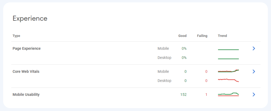
This is so important that in Google Search Console, the default web crawler that Google uses is a mobile web crawler, and mobile usability is one of the top three experience indicators they use:
Checking if Your Website is Mobile-Friendly
So how do you know if you even passed the mobile-friendly test?
If you want to ensure your website can reach its full potential, it is crucial to design it responsively so that it looks good and functions properly on all screen sizes. You can edit and test your website yourself or hire a web developer who can do it for you.
By doing this, you will reach more potential customers and be more likely to rank higher in search engine results.
You can also use Google’s Mobile-Friendly Test tool to check if your website is optimized for mobile devices. As discussed earlier, if your website is not designed responsively, you could be missing out on potential customers and losing business.
What is Responsive Design?
Responsive design is an approach to web design that makes websites function correctly on all devices, from smartphones to tablets to desktop computers.
This feature is noteworthy because it provides a good user experience for people visiting your website on mobile devices. A responsive website will automatically adjust its layout and content to fit the screen size of the device it is being viewed on. Amazing, right?
If your website is not designed responsively, people may have difficulty navigating it and ultimately decide to go with a competitor whose website is more user-friendly.

How to Optimize Your Website for Mobile
Optimizing your website for mobile can be daunting if you are a business owner. You may not know where to start or how to make your website mobile-friendly.
You can take a few easy steps to optimize your website for mobile devices.
1. Your website should have a mobile responsive design.
2. Use large font sizes and buttons.
3. Simplify your navigation menu.
4. Optimize your images.
5. Use short and concise paragraphs.
6. Prioritize mobile-friendly content.
7. Use Accelerated Mobile Pages (AMP).
8. Sign up for Google Search Console.
9. Review the Mobile Usability Report in Google Analytics.
10. Test your website on different devices.
Developing Mobile-Friendly Content
Developing mobile-friendly content is essential if you want to reach your target audience on their mobile devices. This tactic signifies creating copy or content that is easy to read and navigate on a small screen.
Some tips for creating mobile-friendly content include using short paragraphs, bullet points, and large font sizes.
You should also prioritize the most vital information and place it at the top of the page. Plus, it is also essential to optimize your images for mobile devices. This means using smaller file sizes and adding alt text to images.
Making Your Website Load Faster on Mobile Devices
One of the most important things you can do to optimize your website for mobile devices is to make sure it loads quickly.
Ever tried checking out something but the screen lags midway? What did you do? And no, you didn’t wait for it to load, but you did move on with your life, right?
A slow website can be very frustrating for users, and it may cause them to leave your site before they even have a chance to see what you offer.
You can do a few things to speed up your website, such as reducing the size of your images, using a content delivery network (CDN), and using caching. You can also use Google’s PageSpeed Insights tool to check the speed of your website and get tips on improving it.
Google’s Mobile-First Index
In 2018, Google announced that they were rolling out a mobile-first index. This means that Google will now use the mobile version of your website to determine your rankings in search results.
This development is a significant change, meaning you must ensure your website is optimized for mobile devices. You can read their announcement here to learn more about Google’s mobile-first index.
Keyword Research for Mobile With SEMrush

When you want to target mobile users with your marketing campaigns, SEMrush can be a valuable tool. You can use this platform to research the keywords that mobile users are searching for, so you can create relevant and engaging content.
SEMrush also lets you see how your website performs in mobile search results. This information can help identify areas where you need to make improvements.
Should You Invest in Mobile SEO?
Every day, more and more mobile devices are becoming popular with the extensive research that big tech companies are doing to make their devices faster, more powerful, and top of the line.
To reach mobile users, it is crucial to invest in mobile SEO. Mobile SEO can be a significant investment, but it is worth it if you want to stay ahead of your competition and keep your customers happy.
It is vital to reach mobile users because they are always on the go, and their attention might be divided. It would be best if you got them where they are, which is most likely on their mobile device.
Here are some things you should consider when you are thinking about investing in mobile SEO:
-What type of mobile devices are your customers using?
-What type of mobile devices do you want to target?
-How much money are you willing to spend on mobile SEO?
-What is your competition doing in regards to mobile SEO?
-What are your goals for mobile SEO?
If you can answer these questions, you are well on your way to deciding whether or not you should invest in mobile SEO. The most important thing to remember is that mobile SEO is constantly changing, so you must be prepared to change.
It would help if you were willing to spend the money to keep up with your competition. If you are not, they will definitely take advantage of it.
So, should you invest in mobile SEO? A big resounding YES!
App Marketing

In the current mobile-first landscape, app marketing is essential to the success of any business with a mobile app. By definition, app marketing promotes a mobile app to generate awareness and interest, resulting in downloads and engagement.
With over a million apps in the major app stores, competition for attention is fierce. So how can you make sure your app stands out and drives results?
Here are a few tips:
1. Define your audience and understand their needs.
2. Research your competition and find your app’s unique selling proposition (USP).
3. Create a marketing plan and budget for your app promotion.
4. Build a responsive website to drive traffic to your app store listings.
5. Use social media, PR, and influencer marketing to generate interest and awareness.
6. Use paid advertising to reach your target audience.
7. Optimize your app store listings with keyword-rich descriptions and attractive visuals.
8. Encourage user reviews and ratings to improve your app’s visibility and ranking.
9. Use analytics to track your app marketing progress and ROI.
10. Continuously test and improve your app marketing strategy.
Following these suggestions, you can develop a comprehensive and effective app marketing strategy to help you stand out from the crowd and drive results.
AMP Pages
Accelerated Mobile Pages (AMP) is an open-source technology to make the web faster for mobile users. AMP pages are stripped-down versions of web pages designed to load quickly on mobile devices.
AMP pages are built using AMP HTML, a subset of HTML designed to be as lightweight as possible. AMP pages also use AMP JS, a JavaScript library that makes sure that AMP pages are loaded as quickly as possible.
Google has been a significant proponent of AMP pages, and they are currently working on integrating AMP pages into their search results.
This means that if you have AMP pages on your website, there is a good chance that they will be given preferential treatment in Google’s search results.
If you’re interested in creating AMP pages for your website, there are a few things you need to keep in mind.
First, AMP pages must be valid AMP HTML.
Second, you must serve AMP pages from a separate URL than your regular web pages. This is so that Google can cache AMP pages and serve them quickly to mobile users.
Third, AMP pages must be designed to load quickly. This means using minimal HTML and CSS and avoiding JavaScript and other resources that could slow down the page. If you’re unsure whether your pages are loading quickly enough, you can use Google’s PageSpeed Insights tool to test them.
Fourth, AMP pages must be used even without JavaScript. Your website shouldn’t be dependent on Javascript, so it can be loaded even if the user’s device doesn’t support JavaScript.
Finally, AMP pages must be signed using the AMP-Access Signing Certificate so Google can verify that the pages have not been tampered with.
A few plugins can help you create AMP pages if you’re using WordPress. Once you’ve completed your AMP pages, you can submit them to Google using the AMP Validator tool.
App Indexing
App indexing is a technology developed by Google that allows apps to be indexed and ranked in Google’s search results.
App indexing is essential because it allows your app to show up in Google’s search results, even if the user doesn’t have your app installed.
For example, if a user searches for “pizza delivery,” Google may show a list of apps that offer pizza delivery. However, if the user has no apps installed, Google may prompt them to install one.
App indexing is also vital because it allows Google to surface content from your app in other places, such as the Google Now cards.
If you have an Android app, you can enable app indexing by adding a few lines of code to your app. If you have an iOS app, you can allow app indexing by adding support for universal links.
Once you’ve enabled app indexing, you must submit your app to Google for indexing. You can do this using the Google Search Console.
Once your app is indexed, you can start optimizing your app for Google search.
This includes adding the right keywords to your app’s title and description and adding structured data to your app. You can also use Google’s App Indexing API to surface content from your app in Google search.
We know it’s a lot to take in, but by following these tips above, you can get a strong foothold in the game of Google and Mobile App SEO.
Conclusion
Google is constantly changing and updating, making it challenging to keep up with the latest trends.
However, by keeping up with the latest news, updates, and trends, you can ensure that your website or app is well-positioned to take advantage of new opportunities.
Mobile SEO is an important factor to consider in terms of ranking; it can quickly become one of the most important due to the recent mobile trends we have seen. Combined with other SEO strategies, you can easily create a solid plan to help your website or app rank higher in Google’s search results.
Did this article help you? Comment it down below.
About The Author