In order keep up with current online marketplace trends, you must design an ecommerce site that makes finding and purchasing your products a breeze.
Designing an ecommerce site isn’t just about inserting fancy fonts and graphics coupled with a simple HTML editor, and calling it a day. A “fully loaded” ecommerce site represents what your business is all about. You should leave a lasting impact on your visitors and the money that you invest into designing that killer ecommerce platform, becomes value for your online store.
Before we proceed further, consider these ecommerce statistics:
- 40% of the world’s population has bought online.
- PayPal Express checkouts saw a 15% increase in the amount people spend on ecommerce websites.
- 93% consumers consider visual appearance a key factor in influencing their purchases.
- 96% users find videos helpful when making purchases.
- Purchases went up by 45% when mandatory registration was removed from checkout pages.
Why Properly Designing An Ecommerce Website is Important
Over the years, ecommerce has proven its worth, especially from a business perspective. The less time customers spend in transactions, the more you can seamlessly have processed on any given day, thus, seeing higher sales and number of people making comebacks to your ecommerce-fuelled website.
Compared to traditional business and trade, ecommerce websites save you plenty of time and resources which can be redirected to more online facilities, additional web security or investments in new technologies, to name a few. In fact, a variety of new markets have emerged which rely solely on a solid ecommerce web design to cater to consumers at the regional and global level.
In order to stay head to head with leading businesses in your niche and remain ‘applicable and valid’ in today’s virtual market, you will ultimately have to find creative ways to have a prominent ecommerce website, and part of that monumentally hinges on how well it is designed.
Ecommerce Website Design: Is it the Same as a Traditional Website Design?
Well, both kinds of websites do not undergo a design process that is vastly different from one or the other, though you need to factor in additional elements when it comes to ecommerce web design. It’s absolutely vital to factor those in well before the design process begins.
For example, an ecommerce website requires multiple design constructs to be integrated, especially if you’re running an established brand. You need to know what these are right from the start. Apart from this, one major element to consider is your current line up of photos. Let’s say your product photos have a minimalist look, in that case, an elaborate site design won’t be the best or might take a lot of time to integrate well with the photos. The same can be said if we look at it the other way around.
The key take-home is that you need to plan this right from the start, rather than experimenting with multiple designs and arriving at a trial-and-error result, just to find out that the photos do not integrate all that well with your ecommerce site design. This can have a very negative effect on your business and will make the product look embarrassingly bad in front of customers.
Another crucial consideration is the sales funnel and the number of pages that fall between your home page and checkout page. Again, map it out from the very beginning.
Main Elements of a Great Ecommerce Website Design
Here are more key elements that go into a really great ecommerce website design:
Super-duper, Attention-grabbing Content
The bottom line (because we say so): you need authoritative content, not just for your users but the search engines too.
You’re not just opening a portal to selling your products and services online. You’re selling content that relays information and expertise. Authoritative content propagates trust among people who can become lifelong customers. Great, attention-worthy content builds awareness and coaxes more people to share your business on their social media accounts. In the process, you’re also getting much better search engine visibility. So other than what your immediate offerings are, also talk about upcoming events in your company or breaking news happening in your industry.
The top ecommerce websites have really high-quality and highly shareable photos as well as videos. As people, we just love visuals and our minds are wired to readily accept visuals and soak in more information, as opposed to big chunks of text.
If you own a pet store, ditch the static images of cute animals on your main page, and instead have a slideshow of ultra-HD images, or even better, video clips of a customer petting and playing with an adorable pair of Siamese twins purchased from your store.
Easy and Convenient Design Throughout
Choose a website design theme and keep it consistent on every single page; i.e. your content, navigation and design should not mix and match to confuse people, but rather mesh seamlessly to promote high usability and user experience. Speaking of which, colors play a major role in influencing the mood of your users. Think about your brand message and choose your color tones and theme accordingly.
Website colors should be strategically used based on their shade, tint and tone. Just to give you an example, pure and basic colors boast originality, while unmixed hues relay youth, vibrancy and joy. Pure colors speak well to brands who wish to leave a bold signature. Tints or hues are thought of as more calming and peaceful versions of pure colors. They work particularly well to compliment brighter color tints.
Let’s say you are a takeaway business that specializes in pure organic health food – you can use green and white hues in your design as they evoke a feeling of naturalness and freshness.
Structure and Design go Hand-in-hand
The foundation of every good ecommerce website design is the site’s structure. A compelling design not just attracts visitors but also makes it really easy to find what they need, fast. So, decide at the beginning of the design process how many pages there should be, how they will link up together and most important of all, choose the right fonts, graphics and icons to support that infrastructure.
Speaking of structure, site navigation is something that can make or break your online store website. Remember, users are simply there to make a quick stopover, buy what they need and proceed to checkout. Make it easy for them to do so. Try to anticipate what they might look for. Put yourself in their shoes and forge a clear path to the end goal.
Sometimes, a modern and trendy design combined with a really simple CTA is all you need. Check out how seamless and straightforward the navigation is. The products are quick and easy to find as well.
An Effortless Call-to-action
One look at any major ecommerce web design makes it glaringly obvious how the CTA is clearly visible but never pushy. The “buy buttons” are designed with pretty much the same philosophy: telling users what they need to do to buy, without overselling. Going with a simple CTA works best; “Buy Now” or “Add to Cart’ are standout examples.
Some ecommerce sites allow visitors to purchase without even leaving the product page which actually cuts down cart abandonment and drop-off rates. Also observe how CTAs aren’t meant just for the product pages on your ecommerce website. They can be added to funnel pages as well, such as blog subscription pages, ad landing pages or any other parts of the site you feel requires attention.
Quick and Optimized Checkouts
Having an optimized checkout process is not something every site has; it may even take you a while to optimize it to your users’ desire. Continuously monitor this process and generously welcome user feedback. In addition, Google Analytics can be used to set your sights on the checkout process which loses the least users.
Much like design, usability is a component of the checkout process. Users must be offered flexibility with their personal information. They should be asked to provide the least amount of info needed to successfully complete the checkout process. The user payment screen usually sees the most drop-offs; it needs to be simple to use and highly secure.
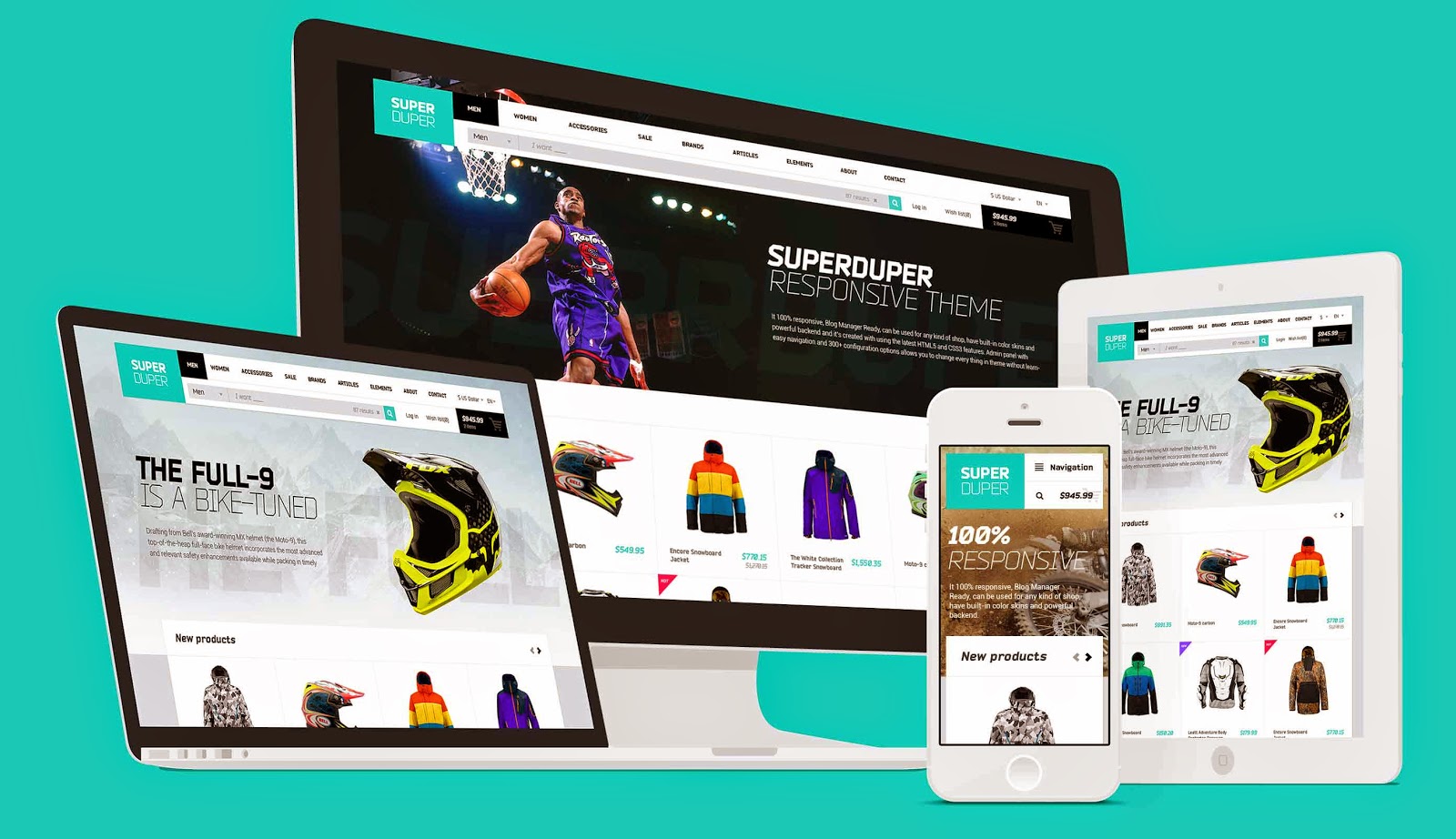
A Great Ecommerce Site is a Responsive One
It is widely known that shoppers everywhere prefer to make purchases via smartphones and tablets whenever they can. An important element of ecommerce site design is responsiveness or in other words, optimized for mobile users.
A responsive design accommodates all screen sizes, or at the very least, the most common ones. Even for those users using older smartphones with smaller screens, the user experience and usability should be seamless in terms of content, images, CTAs and checkouts.
Virgin Atlantic is one example of an ecommerce web experience which is ideally streamlined for mobile users.
How One Ecommerce Website Boosted Revenues by a Slight Design Modification
When you’re planning to make any kind of design changes to your ecommerce website, it is always a good idea to A/B test the changes. This justifies grounds for making those changes and helps you discard changes or ideas which seemed good at the time, but weren’t as effective prior to the A/B testing.
An online Kilt and Scottish Highland Dress retailer, BuyaKilt.com, had multiple category pages which were further divided into four sub-category pages. They wanted to test the idea of a product filter and whether it helps boost conversions. Even though product filters have pretty much become a standard UI component on ecommerce websites, the online kilt retailer wanted to extensively test the idea before making changes.
A product filter was implemented which let visitors purchase by kilt type and pattern. Interestingly enough, there was a staggering 76.1% rise in revenue, with 26% more conversions and 19.76 more shopping cart visits. The A/B testing certainly made its mark and worked brilliantly for BuyaKilt.com.
Test your design changes extensively, no matter what the norm may be in your niche.
How to Create a Superb Ecommerce Website Design: Top 6 Strategies
Here are a few key strategies for really getting that ecommerce design to pop and leave your users mesmerized:
1. A Site That Gleams with Personality
As discussed early on in this article, your ecommerce website is an extension of your brand identity and through that you want to project your values and attributes.
One word (or more than one) should describe what you want your users to see and experience. For example, ‘cool’ or ‘rad’ might work for a fashion apparel business, ‘trustworthy’ for an online insurance provider or ‘warm and homey’ for a local family restaurant. These words can help you decide what personality your website should take. Then, you can decide on the color scheme, layout type, copy and images/videos to be used. Keep in mind though, giving your website personality does not mean making it really flashy, but rather designing it so that it truly speaks to people about who you are.
2. Incorporate Strong Visual Hierarchy
If you think about it, the internet is a highly visual medium, and a trend that’s been soaring these last few years is really high quality gorgeous-looking images.
You want users to be able to visualize what it must be like to touch and feel the product, so to speak, when purchasing it online. And they are able to do this through product imagery. Don’t let your product marred by bad photography. Integrate stunning photos into your ecommerce site to invite people wanting to purchase from you. A service like Gratisography can help you with this.
3. Keep Navigation Simple
Research indicates that 94% users form first impressions about a site based on its navigation and visual appeal.
Stick to simplicity, because users want nothing more than to see an intuitive navigation that feels like second nature. Offering overwhelming options is usually not recommended and instead, what you should do is pay close attention to how your content is organized. Divide navigation into simple sub-categories.
Another navigation aid you’d want to implement is the number of clicks it takes for a user to get to the desired page. Group similar pages under a single navigation item if you must. You can even combine similar pages into a single page. Consider what pages have the highest priority to both you and your visitors. Feature those more prominently.
There’s no need to go back to the drawing board on this one – check out how your top competitors are doing it and that can serve as a good indicator of what users expect from your website’s navigation.
4. Mobile-friendly Design
Always consider those who are viewing your site on handheld devices. In fact, for all you know, most of them might be viewing it on smartphones and tablets, as trends have shifted: an Adobe study revealed that nearly 38% websites in their group were visited by smartphone users in the US, while this number rose to 52% for UK websites. The study concluded that ecommerce websites needed to streamline their mobile user experience to boost conversion and ‘stickiness’; something that’s used to measure landing page performance and customer acquisition.
Go for a mobile-first strategy for improving user experience and see your conversions go off the charts. Additionally, Google has a tool that lets you check how mobile-friendly your website is.
5. Use the Right Product Filters
Most visitors arriving at your site have a fair idea of what they want, so what you should do is use the relevant filters to help them buy what they need. Many ecommerce sites, unfortunately, fail to implement this properly, even when it comes to core item categories.
Play it smart and add filters. Keep in mind the criteria that shoppers value the most. For example, you can create filters according to materials, prices, brands and sizes. Place these filters in strategic positions or reveal them once a shopper arrives at a category page. Make sure the product filters are always clearly visible, otherwise you’re not adding much value to begin with.
6. Optimize Checkouts
Want the most conversions on your ecommerce website? The best designed sites have a clear and simple, distraction-free checkout process. Ideally, avoid having more than two pages from the ‘Add to Cart’ page to the final checkout page. Also, it is best not to ask customers to register in order to make purchases. If you ask for contact information at this stage, you risk driving them away.
Keep the clutter to a minimum, and no matter how many products and categories you have, the checkout pages need to be kept 100% simple, straightforward and free of unnecessary distractions or hindrances.
So How Does the Future of Ecommerce Web Design Look?
Considering the rise of ecommerce, particularly on the mobile front, what future design trends can we look forward to?
For one, there’s going to be a lot of multi-channel shopping, heavy social media selling, beacon technologies, personalization and loyalty programs. Consider these:
Just last year, it was predicted that beacon technology would drive $44 million in retail sales
78% local business searches through mobile resulted in a purchase
75% of mobile shoppers have used a mobile coupon
73% prefer to do business with companies who are willing to personalize user shopping experiences; 86% reported personalization acts as a major influencer in buying decisions
Digital technologies and IoT (internet of things) continue to evolve rapidly. Ecommerce businesses will be finding every possible opportunity to utilize these resources, and website design specifically, will be one of the ultimate deciders of how well those resources are utilized.
Whether you want to make your ecommerce web design more mobile-friendly or capitalize on social media selling, don’t just focus on one aspect. Use this guide to focus on some of the key elements and then some more.