If you’ve ever tried to brand a SlideShare Pro Account, you already know the pain: you resize an image, upload it, and it either gets cropped oddly, rejected outright, or looks blurry once it’s live. Then a few months later, the platform tweaks a spec and you’re back to guessing again.
This happens because most “cheat sheet” style resources just throw numbers at you (a pixel dimension here, a file size there) without explaining why those limits exist or how to actually use them to build a channel that people take seriously. Below is a practical breakdown of what a SlideShare Pro Account actually requires, plus the context that most sizing charts leave out.
Why SlideShare Still Matters for B2B Content
SlideShare gets described as “the YouTube of PowerPoint,” and that comparison holds up. It’s one of the few platforms built specifically for long-form, skimmable business content, presentations, whitepapers turned into slide decks, and infographics that would otherwise get buried in a PDF nobody opens. Because it’s owned by LinkedIn, content shared there can plug directly into LinkedIn distribution, which matters if LinkedIn is already part of your B2B marketing strategy.
A free account gets you basic uploading, but a Pro Account is what unlocks channel branding, a custom header, a profile image, and an “About” section that makes your page look like an owned piece of real estate rather than a random upload dumped on a shared feed.
SlideShare Pro Account: Branding Requirements
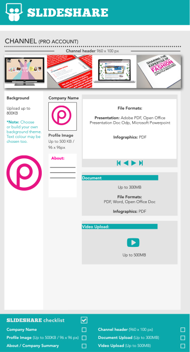
Here’s what a fully branded Pro Account channel actually needs, broken down by element.
Channel Header
- Dimensions: 960 x 100 px
- This sits at the top of your channel and is the first thing a visitor sees before any content. Keep text minimal. At this height, anything smaller than a large headline font gets illegible fast.
Background Image
- File size limit: Up to 800KB
- You can upload your own background or build one from a themed template, and the text color on top of it is customizable. Because this sits behind everything else on the page, high-contrast, low-detail backgrounds tend to hold up better than busy photography.
Profile Image
- File size limit: Up to 500KB
- Dimensions: 96 x 96 px
- This is small (smaller than most social avatars), so a detailed logo will often just read as a smudge. A simplified mark or icon version of your logo usually performs better than the full wordmark version.
About / Company Summary
- A short block of text under your profile image. Treat it the way you’d treat a meta description: front-load the keywords and value proposition, because most visitors won’t scroll past it before deciding whether to explore further.
File Upload Specs by Content Type
This is where most sizing guides fall short. They cover the branding elements but skip the actual upload requirements, which is usually the part people get stuck on.
Presentations
- Accepted formats: Adobe PDF, OpenOffice Presentation (.odp), Microsoft PowerPoint
- File size limit: Up to 300MB
Infographics
- Accepted format: PDF only
- File size limit: Up to 300MB
Documents
- Accepted formats: PDF, Word, OpenOffice Doc
- File size limit: Up to 300MB
Video
- File size limit: Up to 500MB
A quick note here: SlideShare (like every platform) revises these limits periodically, so treat the numbers above as a strong reference point rather than gospel. If something fails to upload, check the current limit directly on the platform before assuming your file is the problem.
Your Pre-Launch Checklist
Before you publish a new SlideShare channel, run through this:
- Company name added
- Profile image uploaded (under 500KB, 96 x 96px)
- Channel header uploaded (960 x 100px)
- About / company summary written
- Document upload tested (under 300MB)
- Video upload tested (under 500MB)
Getting the Sizing Right Is the Easy Part
Here’s the thing sizing charts never tell you: getting the dimensions correct doesn’t make a channel perform. It just means your channel looks professional instead of broken. The actual work (the part that determines whether anyone finds or shares your content) is what you put inside those correctly-sized frames.
A few things that make a bigger difference than pixel-perfect branding:
Treat visuals as a ranking factor, not decoration. Search engines and viewers both respond to well-labeled visual content. If you’re uploading infographics or slide decks, make sure every image is titled and alt-tagged with the keywords you actually want to rank for, this is one of several tactics covered in how to get the most out of visual content across your marketing.
Build for the platform it’s going to live on next. Since SlideShare content flows naturally into LinkedIn, it’s worth pressure-testing your slides against what actually performs there, this LinkedIn marketing checklist is a useful gut-check before you publish.
Don’t treat it as a one-and-done upload. Growing a following on any professional network is a slow-burn habit, not a single campaign. The same daily-consistency principles in this guide to growing LinkedIn connections apply almost directly to building a SlideShare audience.
Know where SlideShare fits in your broader content mix. It’s one format among several (alongside video, carousels, and written posts), so it helps to zoom out and look at where content trends are heading before deciding how much weight to put behind it.
If lead generation is the actual goal, say so explicitly. SlideShare decks are one of the more underused tools for B2B lead generation, a well-built slide deck with a clear CTA slide can outperform a blog post for capturing intent, simply because it feels less like an ad.
Pair organic uploads with paid amplification once you have proof of concept. Once you know a specific deck resonates, it’s often worth testing it as paid content rather than relying purely on organic reach, the targeting logic in this overview of paid social lead generation applies to slide-based content too.
Don’t lose sight of the bigger picture. Every platform-specific tactic should tie back to a coherent strategy rather than existing in isolation. This framework for how social media relationships actually develop is a useful way to sanity-check where SlideShare content fits in your funnel.
Remember content still beats format. No amount of correct pixel sizing rescues a slide deck built on outdated advice. Give the content itself the same scrutiny you’d give any other channel. This breakdown of what actually drove engagement across social platforms is a good gut-check before you invest more time in SlideShare specifically.
The Bottom Line
The sizing specs above will keep your SlideShare channel from looking amateurish. But the platforms and their pixel requirements will keep shifting. What won’t shift is whether your content is actually worth uploading in the first place. Get the dimensions right, then spend the rest of your time on the slide content itself.
Source: http://thepinkgroup.co.uk/
About The Author