Why Image Optimization Matters for SEO
Images are a vital part of engaging web content, but they can also significantly impact your website’s performance and search rankings. Large, unoptimized images often make up the bulk of a webpage’s size, slowing down load times. Google considers page speed as a ranking factor, especially with the advent of Core Web Vitals, so optimizing images improves your SEO by boosting site speed and user experience. Faster-loading pages tend to keep visitors engaged (reducing bounce rate) and can lead to better conversion rates – for instance, a Google study found that extending page load from 1 to 3 seconds can increase bounce rates by 32%. Additionally, optimized images (with proper metadata) can rank in Google Images, driving extra traffic to your site. In short, image optimization helps search engines understand your content and ensures your pages load quickly, both of which are crucial for SEO success.
Use Descriptive Alt Text for Every Image
Alternative text (or “alt text”) is a written description of an image in the HTML alt attribute. It serves two key purposes: accessibility and SEO. For visually impaired users or anyone who can’t load images, alt text describes the image’s content. For search engines, alt text provides context about the image’s subject matter, since crawlers can’t “see” images directly. In fact, Google regards alt text as the most important image attribute for SEO, using it (in combination with computer vision algorithms and surrounding page content) to understand an image’s content.
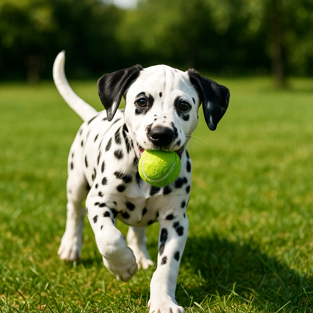
Best practices: Write concise, meaningful alt text that describes what’s in the image and its purpose in context. For example, alt="Dalmatian puppy playing fetch" is much more informative than alt="puppy". Include relevant keywords if they naturally fit the description, but avoid keyword stuffing or overly long descriptions. The text should read naturally to a human. If an image is purely decorative or irrelevant to content, you can use an empty alt attribute (alt="") so it’s skipped by screen readers (this has no SEO value, of course, but improves accessibility). Always add alt text through your platform’s interface (e.g. the Alt Text field in WordPress’s media library or in your ecommerce product image settings) so that it’s embedded in the HTML. Many SEO tools flag images missing alt text because it’s such a critical element for image SEO.
Tip: Don’t confuse alt text with an image’s title attribute or caption. The title (tooltip) is not used by Google for rankings, whereas alt text does influence SEO. Focus your effort on alt text, and use captions only if they add useful on-page context.
Use Descriptive File Names
Before you upload an image, name the file with descriptive, keyword-relevant words separated by hyphens. Just like alt text, a good file name gives search engines a clue about the image’s subject. For example, a filename like my-new-black-kitten.jpg is far more informative than a generic IMG00023.JPG or image1.png. Descriptive file names can slightly boost your image’s relevance in search and make it easier for images to show up for related queries.
Best practices: Use lowercase letters, numbers, or hyphens (-) in file names (avoid spaces or special characters which can cause URL issues). Hyphens are preferred as word separators – for instance, backyard-fire-pit.jpg is better than backyard_fire_pit.jpg, since Google may not recognize underscores as separators. Incorporate a primary keyword if it describes the image, but keep the name concise and accurate (e.g. red-running-shoes.jpg for a product image of red running shoes). If you have many images, maintain a consistent naming convention. For multi-language sites, consider naming localized images in the target language for each locale (and ensure the URL encoding is correct for non-Latin characters). This level of detail helps search engines and also keeps your media library organized.

Choose the Right Image File Format
Choosing an appropriate file format for each image can greatly impact both quality and file size, which in turn affects SEO (via page speed). Common web image formats include JPEG, PNG, GIF, SVG, as well as more modern formats like WebP and AVIF:
-
JPEG (JPG): Ideal for photographs or complex images. Uses lossy compression, meaning some quality is sacrificed to reduce file size. JPEGs produce much smaller files than PNG for photos, so use JPEG for most photographic images where fine detail and millions of colors are present (e.g. product photos, banners). No transparency support.
-
PNG: Supports lossless compression and transparency. Best for graphics, logos, icons, or images needing transparency or crisp lines (e.g. screenshots or diagrams). PNG files are larger than JPEGs for photos, so reserve PNG for when you need high fidelity or transparent backgrounds.
-
GIF: Used only for simple animations or very small graphics. GIFs are limited to 256 colors, so they’re not suitable for photos. For animations, consider using MP4 video or WebP animations for better compression. (If you have an animated GIF, converting it to video can drastically reduce size while improving quality.)
-
SVG: A vector format for logos, icons, and illustrations. SVGs are resolution-independent (they look crisp on any screen) and often very small in file size for simple graphics. Use SVG for flat graphics or logos whenever possible – they scale perfectly and are SEO-friendly (SVGs can contain searchable text).
Modern image formats like WebP and AVIF offer superior compression for the web. WebP (developed by Google) supports both lossy and lossless compression, as well as transparency. It often produces images 25–34% smaller than equivalent JPEGs for similar quality. AVIF is a newer format (based on the AV1 video codec) that can achieve even smaller file sizes – roughly 50% smaller than WebP for the same quality in some cases. Both WebP and AVIF maintain visual quality while significantly reducing bytes, which greatly improves page load speed. Many platforms now support WebP and AVIF: for instance, Google Search indexes images in WebP and AVIF just like JPEG/PNG, and modern browsers widely support them. Use modern formats when you can: a photo saved as WebP or AVIF will usually load faster than the same photo as a JPEG, with no noticeable difference to the user.
That said, implement new formats with care. Ensure you have fallbacks for older browsers that may not support AVIF/WebP (you can use the <picture> element or server-side negotiation to deliver JPEG/PNG to those). In many cases your CMS or CDN might handle this for you (for example, Wix automatically converts uploaded images to AVIF for performance, and some WordPress plugins or CDNs will serve WebP/AVIF versions to compatible browsers). The goal is to deliver the smallest file size possible without sacrificing quality. Use the format that best fits the image content – e.g. keep logos as SVG or PNG (for sharpness), use JPEG/WebP for photographs, and try AVIF for maximum compression if supported.
Compress Images to Reduce File Size
Once you’ve chosen the format, it’s crucial to compress your images so they load quickly. Compression removes or reduces redundant data in the image file. This can be lossless (no visible quality loss, just removing metadata or optimizing encoding) or lossy (sacrificing a small amount of quality for a big reduction in size). Proper compression can shrink file sizes dramatically – for example, it’s not uncommon to cut an image’s size by 50% or more with negligible quality difference, which has a direct positive effect on page speed.
Best practices: Aim for the smallest file size that still looks good on the device and resolution it’s served. As a general rule, keep each image under ~100 KB for typical web dimensions, and under 50 KB if possible for small thumbnails or icons. Many experts recommend ~70 KB or less for standard images to balance speed and quality. Of course, larger high-resolution images (hero banners, full-width photos) might be a bit bigger, but even those should usually be a few hundred KB at most, not several MB.
Tools and techniques for compression:
-
Online compressors: Free tools like TinyPNG, TinyJPG, or Compressor.io let you upload an image and download a compressed version. These use smart lossy algorithms to reduce file size while preserving quality. For example, TinyPNG (despite its name) works for PNG and JPEG/WebP, and often achieves 50-80% size reduction with hardly visible change.
-
Browser-based tools: Google’s Squoosh (squoosh.app) is an interactive compressor that runs in your browser. You can load an image, compare quality at different compression levels (e.g. adjust JPEG quality or convert to WebP/AVIF), and download the optimized result. This is great for one-off optimizations and learning how different settings affect quality.
-
Desktop software: Image editors like Photoshop have a “Save for Web” or export function where you can adjust quality settings. There are also dedicated batch compression tools (ImageOptim, RIOT, etc.) and even command-line tools for the tech-savvy (like using Imagemagick scripts).
-
CMS plugins/services: If you use a CMS like WordPress, consider plugins such as Smush, ShortPixel, or Imagify. These plugins automatically compress images on upload (and often can bulk-compress existing images), optionally converting to WebP as well. They can strip unnecessary metadata and apply lossy compression within set thresholds. On Shopify and Squarespace, you can use apps/extensions like TinyIMG to automate image optimization in bulk. Many of these services use an API (like TinyPNG’s API or ShortPixel’s API) to crunch images on their servers and return optimized versions.
-
CDN-based optimization: Some content delivery networks (CDNs) or performance services (e.g. Cloudflare Polish, Cloudinary, Imgix, Akamai Image Manager) will automatically optimize and serve images in the best format/size for each user. For example, Cloudflare’s Pro plan can auto-compress and serve WebP, Cloudinary can manage your images and deliver optimized versions on the fly, etc. These solutions are more advanced but can offload the work completely.
When compressing, balance quality and size. Extremely aggressive compression might make images look pixelated or blurry, which hurts user experience and credibility. Aim for “good enough” quality at the smallest size. A quick way to test: after compression, open the image on a large screen and ensure it still looks clear and professional. If you notice obvious degradation, bump the quality a bit. Also, remember to resize images to appropriate dimensions before or during compression – which leads to our next topic.
Resize and Responsively Serve Images for Mobile & Desktop
One common mistake is uploading a huge 4000×3000 pixel image and then using HTML/CSS to display it at a smaller size (e.g. a 400px thumbnail). The browser still has to download the full large image, wasting bandwidth and time. A key part of image optimization is resizing images to the maximum size they’ll be displayed on your site, and ideally using responsive techniques to serve different sizes to different devices. This ensures mobile users aren’t forced to download giant desktop-sized images and vice versa.
Responsive images: Leverage HTML features like the srcset attribute and <picture> element to deliver appropriately sized images based on screen size or pixel density. For example, you might have a product image in three sizes (400px, 800px, 1200px width). Using srcset, you can hint the browser to choose the best size for the user’s device (a phone would get the 400px version, a retina laptop might get the 800px or 1200px version, etc.). This way, each device gets an image optimized for its screen dimensions, reducing download weight without sacrificing quality. Modern platforms often handle this automatically: WordPress generates multiple sizes of each uploaded image (thumbnail, medium, large, etc.) and by default includes a srcset in the image tag so the browser picks the right one. Squarespace and Wix similarly resize images for various layouts/resolutions on the fly. If you’re coding a custom site, consider using <picture> to serve different image files for different conditions (e.g. a wider crop for desktop vs. a square crop for mobile, or AVIF for supporting browsers and fallback to JPEG for others).
Mobile optimization: Ensure that on smaller screens, you not only serve smaller pixel dimensions but also consider using slightly higher compression (since on mobile screens minor quality loss is less noticeable). Also, use the correct aspect ratio so images display without layout shifts (define width/height or use CSS aspect-ratio to avoid cumulative layout shift issues). Test your pages on mobile devices and check Google’s PageSpeed Insights for flags like “Properly size images” or “Serve images in next-gen formats” – these will tell you if you’re sending overly large images or not using WebP/AVIF when you could.
High-DPI (Retina) images: For very sharp displays, you might serve 2x pixel-density images. Many site builders handle this (e.g. Wix recommending 2560px wide images for large displays). If you do this, use srcset with x descriptors (like image.jpg 1x, [email protected] 2x) so high-DPI devices get the higher resolution only if needed. This ensures crisp visuals without penalizing normal devices with extra-large files.
Finally, always test your pages on both desktop and mobile. Use tools like PageSpeed Insights or Lighthouse to see how image loading affects your performance on different devices. A responsive, mobile-friendly approach to images will improve load times for mobile users (which is critical, as mobile-first indexing means Google predominantly uses the mobile version of your site for ranking). It also boosts user experience – images that load fast and fit the screen nicely will keep visitors on your site longer.
Enable Lazy Loading for Off-Screen Images
“Lazy loading” is an optimization technique that defers loading images (or other content) until they are actually needed – typically, when the user scrolls near them. Instead of loading dozens of images on initial page load (including those far below the fold that the user hasn’t seen yet), you load only the images in the viewport and lazy-load the rest as the user scrolls down. This dramatically reduces initial page payload and speeds up the perceived load time, which benefits SEO because of improved page speed and a better user experience.
SEO benefits: By loading fewer resources up front, lazy loading can improve your Largest Contentful Paint (LCP) and overall page speed metrics – factors that Google uses in rankings. It also reduces server load and bandwidth usage, which can indirectly improve performance and costs. Users are more likely to stay on a fast, responsive site, improving engagement and lowering bounce rates (positive for SEO).
How to implement: The easiest way is using the native HTML attribute loading="lazy" on <img> tags (supported in all modern browsers). For example: <img src="photo.jpg" alt="..." loading="lazy">. This tells browsers to hold off loading that image until it’s about to scroll into view. Most major platforms have adopted this: WordPress, for instance, adds loading="lazy" by default to embedded images on posts/pages (except possibly the very first banner image, to avoid delaying it). If your platform or theme doesn’t add it automatically, you can usually enable it with a plugin or a small code change. For example, in WordPress you might use a plugin like WP Rocket or a simple filter to enable native lazy loading. In Shopify or custom sites, you may include the attribute in your HTML or use a JavaScript approach if needed.
If you use a JavaScript lazy-loading library (common before native support), ensure it’s SEO-friendly. Modern libraries use IntersectionObserver to detect when images enter the viewport and swap in the real image source. Just make sure that in your HTML, images have proper src or a data-src with a fallback <noscript> tag containing a standard <img> – this way, search engine bots (or users with JS disabled) can still find the image. Google’s crawler can execute JavaScript and usually will see lazy-loaded images, but it’s wise to provide a noscript fallback for critical content, or stick to the native loading attribute for simplicity.
Important: Do not lazy-load images that appear above the fold (especially your main banner or any image that is the Largest Contentful Paint element). If an image is immediately visible on page load (e.g. hero image at top), it should be loaded eagerly. Lazy-loading above-the-fold images can hurt performance – the browser will delay loading them, making your page slower to show its most important content. In fact, Google’s PageSpeed Insights will flag “LCP image was lazily loaded” as an issue because it adds loading delay. So, lazy load all the below-the-fold images (e.g. in long articles or product galleries), but exclude the first one or two images that users see right away.
In summary, lazy loading is a great optimization for pages with many images (blogs, portfolios, e-commerce category pages, etc.). It boosts loading speed and conserves bandwidth, which improves SEO through better page experience. Just implement it carefully: use native lazy loading or a proven technique, and make sure search engines can still index your images.
Create an Image Sitemap for Better Indexing
An image sitemap is an XML file (similar to a regular sitemap) that lists the image URLs on your site, along with metadata like the image title or caption. Its purpose is to explicitly tell search engine crawlers about your images – think of it as a “guidebook” for search engines, pointing them to all the important visuals on your website. While Google can discover images by crawling your pages, an image sitemap ensures no image is missed, especially if some are loaded via scripts or buried in galleries that are hard to reach via normal crawling.
SEO benefits: Submitting an image sitemap can lead to enhanced visibility in image search results. You increase the chances that Google indexes all your images and understands their context, which means those images are more likely to appear for relevant searches. This is particularly valuable for image-heavy sites (e.g. photography portfolios, e-commerce stores) where image search can drive traffic. An image sitemap can also ensure faster indexing of new images– if you add a batch of product photos or a new blog post with images, updating your sitemap lets Google know right away, rather than waiting for it to recrawl the site.
How to implement: In many cases, your platform or SEO plugin can handle this:
-
WordPress: If you use an SEO plugin like Yoast SEO, RankMath, or All in One SEO, they usually include images in your sitemap automatically. For example, Yoast’s sitemap will list each post/page URL and include the
<image:image>entries for images on that page (with their loc and title/alt). Ensure this is enabled in the plugin settings. If not using a plugin, WordPress core has a basic sitemap functionality (since v5.5), but it may or may not include images by default. You could use a dedicated sitemap generator plugin or an online tool to generate an image sitemap if needed. -
Shopify: Shopify automatically generates a sitemap.xml for your store that includes your products, collections, blog posts, etc. It typically does include images (e.g. product images) in those sitemap entries. Double-check by opening
yourstore.com/sitemap.xml– you should see image URLs listed for each product. If you need to add other images (like those in blog content), consider a Shopify app or ensure your theme’s code outputs proper<img>tags (so that Shopify’s crawler includes them). Shopify’s SEO documentation encourages creating image sitemaps, so most of it is likely built-in. -
Wix: Wix automatically manages your sitemap as well. In Wix SEO settings, there’s an option to include all media. Wix’s infrastructure is pretty SEO-friendly out of the box, so they should list images in the sitemap. Always verify via yourdomain.com/sitemap.xml or Wix’s SEO tools.
-
Squarespace: Squarespace generates a sitemap index (e.g. yourdomain.com/sitemap.xml) that links to sitemaps for pages, blog posts, products, etc. Historically, Squarespace sitemaps included the page URLs but not always all images. However, they now often include image info for galleries or products. If you want to be thorough, you can use an extension like TinyIMG or a third-party tool to generate a dedicated image sitemap and submit it in Google Search Console.
-
Custom HTML sites: You can manually create an image sitemap XML. The format is an extension of the standard sitemap protocol. For each URL entry, you add
<image:image>child tags with<image:loc>http://example.com/path/to/image.jpg</image:loc>and optionally title, caption, license tags. Google’s documentation provides the exact syntax. If coding by hand is cumbersome, use a generator: some SEO tools or sitemap generators can crawl your site and output an image-inclusive sitemap. Once generated, upload it to your site (e.g.image-sitemap.xml) and reference it in yourrobots.txtor directly submit it to Google Search Console.
Maintaining an image sitemap is especially useful if you frequently add images or if some images are accessible only via user interaction (like a slideshow) and might be missed by normal crawlers. It’s a one-time effort to set up (or just a plugin activation) that can yield ongoing SEO benefits by ensuring all your visuals are on Google’s radar.
Utilize Structured Data for Images (Schema Markup)
Structured data (schema markup) is a way to provide extra machine-readable information about your content, including images. By adding structured data to your pages (typically in JSON-LD format in the HTML <head> or inline), you help search engines understand the role and context of images on the page. In some cases, this can lead to rich results or special treatment of your images in search.
Google Images can display special badges or labels on image search results when structured data is present (e.g. “Recipe” or “Video” icons), as shown above. By using schema markup, you make your pages eligible for these enhancements. For example, if you have a recipe site, adding Recipe schema (with "image" property) can make your food photos appear with a small recipe badge in Google Images, attracting users looking specifically for recipes. Similarly, Product schema with image data might show a product badge or allow Google to display price/availability with the image. A VideoObject schema can cause a play icon overlay on your video thumbnail in image results, and CreativeWork schemas (like Article, Recipe, etc.) can show a contextual label.
Implementing structured data for images: The specifics depend on your content type, but a few general guidelines:
-
Always include an
"image"field in your structured data for things like Articles, BlogPosts, Products, Recipes, etc. Google often requires an image for those rich result types. The"image"field should contain the direct URL to your image, and you can usually provide an array of images (different resolutions). For example, a Product schema JSON-LD might have"image": ["https://example.com/images/red-shoe.jpg"]along with other properties like name, price, etc. -
Use the correct schema type: If you’re selling products, use Product schema; if you have recipes, use Recipe schema; for general articles or blog posts, use Article/BlogPosting schema. Each of these has an image property. (Some CMSs handle this automatically: Shopify themes often output JSON-LD for Product, including images; WordPress SEO plugins output Article markup for posts and include the featured image.)
-
ImageObject: In cases where an image itself is the primary content (like a photo detail page or infographic page), you can use the ImageObject schema. This schema lets you specify the image’s URL, caption, license, creator, etc. It’s useful if you want to provide maximum info about an image. Additionally, if you license your images, Google has a specific Image License metadata format (either structured data or
<meta>tags) to show a “Licensable” badge on your image in search. -
Metadata to include: At minimum, the image URL. Optionally include
"caption"or"description"if the schema allows (or"alt"as"description"in ImageObject). For products, include"sku","brand", etc., which indirectly tie to the image context. For recipes, include"recipeCuisine","calories", etc., in addition to image – a rich combination helps Google pair that yummy image with relevant queries. Basically, the more complete the structured data, the better.
The payoff of structured data is twofold: (1) Search engines get a clearer understanding of how images relate to the rest of your content, and (2) you unlock eligibility for those eye-catching search result features (badges, rich snippets) that can improve click-through rates. For instance, an image with a “Recipe” badge might entice a user to click knowing it leads to a recipe page, which is better targeted traffic for you.
Practical example: Suppose you have a blog post that includes a how-to infographic. You might mark up the page with Article schema including the infographic URL in the image field. If the infographic has a title, you could include that as the image caption in schema. Now, if someone searches Google Images for that topic, your image might appear with a small icon or just benefit from the extra context, potentially ranking higher because Google understands it’s part of a specific article.
Most marketers won’t write JSON-LD from scratch – instead, use your tools. Yoast SEO (WordPress) automatically adds schema for posts/pages and will use your featured image. Shopify outputs product schema by default. Wix and Squarespace have less manual schema access, but they handle a lot internally (Squarespace, for example, adds some Organization and Website schema and you might need developer mode for custom schema). If you need to, you can embed custom JSON-LD in advanced settings or via a tag manager. Always test your structured data with Google’s Rich Results Test or the Schema Markup Validator to ensure it’s correctly formatted.
In summary, while structured data isn’t a direct ranking boost, it enhances how your content (and images) appear in search. This can lead to higher CTR and more qualified visitors. It’s an advanced optimization, but one well worth implementing, especially for e-commerce and content-rich sites.
Platform-Specific Image Optimization Tips
Finally, let’s break down some practical steps for popular platforms. Many image SEO principles are universal (alt text, compression, etc.), but the implementation can differ on WordPress vs. Shopify vs. Wix, etc. Here’s what marketers should know for each:
WordPress
-
Alt text: WordPress makes it easy – whenever you upload an image in the Media Library, fill in the Alternative Text field. You can also add alt text in the block editor: click the image block and set the alt text in the sidebar. This ensures the
altattribute is output in the HTML. Make it a habit that every image gets alt text on upload; you can even use plugins like Yoast SEO to get reminders of images missing alt tags. -
File names: Rename files descriptively before uploading to WordPress. If you upload
DSC1234.jpg, that becomes the file URL. Changing it later is cumbersome (it would require re-uploading or a plugin). So use good names upfront (e.g.,summer-hiking-trail.jpg). WordPress preserves your file name in the URL, which can carry those keyword hints for Google. -
Compression & resizing: WordPress now by default does some image compression (it typically scales down very large images to a max size and saves JPEGs at somewhat reduced quality, around 82%). Still, it’s wise to optimize images before or during upload. Use plugins like Smush, ShortPixel, EWWW Optimizer, or Imagify – they can automatically compress images on upload and even convert to WebP for you. Many have free tiers (with monthly limits) and paid plans for larger sites. Also, when adding images to pages, select an appropriate size (thumbnail, medium, large, full) rather than inserting a massive original if it’s not needed. WordPress’ responsive images (
srcset) feature will serve smaller versions on mobile automatically, provided the theme’s HTML uses the standardwp_get_attachment_image. Most modern themes do, so you get that benefit without extra work. -
Lazy loading: Since WordPress 5.5, all images have
loading="lazy"by default, which covers most use cases. As of WordPress 5.9+, the first content image is not lazy-loaded to avoid LCP issues, which is ideal. Just keep this in mind if you see PageSpeed complaining about lazy-loaded LCP – update WordPress or manually omitloading="lazy"on that image. If using an older WP version or a very custom theme, you might need a plugin or manual code to implement lazy loading, but for the majority it’s automatic now. -
CDN and hosting: If your audience is global or your site heavy with images, consider serving images through a CDN. Some WordPress hosts (like WP Engine, Kinsta) have built-in CDN and even image optimization. Or you can use Jetpack’s Site Accelerator (formerly Photon) – a free image CDN that caches your images on WordPress.com servers and serves them quickly worldwide, also automatically converting them to WebP for supported browsers. It’s a free toggle-on option if you already use Jetpack. Cloudflare’s free plan also serves your images from cache (but their WebP conversion is a paid feature). In any case, a CDN can offload bandwidth and speed up image delivery, which helps with SEO indirectly via speed.
-
Sitemap & schema: Ensure your SEO plugin includes images in the sitemap (Yoast does this out of the box). For schema, Yoast and others will include the featured image or others in Article schema. If you have WooCommerce (products), use a plugin or theme that outputs Product schema (including images). Many WooCommerce SEO plugins or themes like Storefront handle this.
Shopify
-
Alt text: In Shopify’s admin, you can add alt text to each image. For product images, go to the product in admin, click on the image and edit the Image Alt Text field. Shopify also allows alt text for collection images and blog post images. Make sure every product photo and graphic has alt text describing the product or content (this is both SEO and accessibility best practice, and Shopify will show a warning in its SEO checklist if alt text is missing).
-
File names & URLs: When you upload images to Shopify, the platform will generate URLs that include your file name (sometimes with a hash). Using descriptive file names is still beneficial. For example, uploading
blue-handmade-mug.jpgis better thanimage1.jpg– the URL will carry those words, and it’s just cleaner. It’s a small ranking factor, but worth doing as part of a good workflow. -
Image formats: Shopify serves images through its built-in CDN (Cloudinary behind the scenes). It actually can serve WebP to supported browsers automatically – if you check your site in Chrome, your JPEGs might be delivered as WebP with a
.jpg.webpextension in the URL. This is handled by Shopify’s servers, so you don’t need to manually convert to WebP. Just upload high-quality JPEG or PNG, and Shopify will do format optimization when possible. (They don’t yet support AVIF, as far as I know, but that could change). Still, you should upload images in reasonable sizes – Shopify will create multiple scaled versions for different container sizes, but if you upload a monstrous 10MB image, you’re still hurting yourself until it’s scaled down. A good rule: stick to ~2048px (width) or so for product images unless zooming requires more. And aim for under 500 KB per image file after your own compression. -
Compression: Shopify doesn’t automatically compress your originals during upload, so optimize beforehand. Use a tool like TinyPNG on your product photos before uploading to squeeze out bytes. Additionally, you can use Shopify apps like Crush.pics, TinyIMG, or SEO Image Optimizer – these can compress images in your store after upload and even do things like add ALT texts in bulk or rename file references. Be cautious and backup if you use an app to overwrite images. Often, compressing before uploading is safest and free.
-
Lazy loading: Many Shopify themes (especially newer ones or OS 2.0 themes) have lazy loading built-in for images further down the page. Check your theme’s documentation or code – you might see
loading="lazy"on image tags. If not and you have a long homepage or many images, consider adding it. If you’re not comfortable editing theme code, you could find a Shopify expert or see if an app can enable lazy loading. But most likely, your product listing grids and other sections already lazy load by default now, because Shopify knows it improves performance. -
Responsive images: Shopify’s image URLs allow specifying dimensions (via URL parameters or suffixes like
_400x.jpg). Themes take advantage of this by serving appropriately sized images in different contexts. As a marketer, just ensure your product images are high enough resolution for zoom/large view, and the theme will handle thumbnails. If you create any custom HTML sections, use thesrcsetapproach similar to WordPress for any raw<img>tags you add. -
CDN: Good news – by default all Shopify stores use a global CDN for assets (images, CSS, etc.). So your images are already being delivered from servers near your users. This is one less thing to worry about; you’re covered out of the box.
-
Sitemap & schema: Shopify auto-generates a sitemap that includes your images (particularly product images). It also outputs structured data for products and articles. To leverage this, fill in all relevant info: product pages should have price, availability, etc., so that the Product schema (including the image) is complete. For blog posts, the featured image will be in the Article schema. In short, Shopify’s doing the heavy lifting, but you must provide the content (good titles, descriptions, alt texts) for it to feed into SEO.
Wix
-
Alt text: Wix has a user-friendly editor where you can click on an image and add alt text in the settings. Make sure to do this for all images – Wix’s SEO Wizard will actually prompt you if you have images missing alt text. Use descriptive alt text as discussed (Wix sites can rank well in image search if this is done, despite old myths about Wix SEO).
-
Format & optimization: Wix automatically handles a lot of optimization for you. When you upload an image, Wix will convert it to AVIF format for modern browsers, which yields much smaller file sizes (50% smaller than WebP in many cases). It also will serve WebP as fallback for browsers that don’t support AVIF, and PNG/JPEG if needed. In short, you can upload standard JPEG/PNG and Wix will do “next-gen” optimization behind the scenes. They also automatically compress images on your live site using these formats. Wix also creates multiple sizes of your images and will deliver the optimal size depending on device/resolution (their responsive imaging is built-in, aligned with their responsive templates).
-
Guidelines: Wix recommends uploading high-resolution images (at least 2560px wide) for best quality on large screens, but also asks that you compress files larger than 25MB before uploading (25MB is the max upload, but that’s huge – you should rarely need that). In practice, aim for images under 1MB or a few hundred KB; Wix will compress further when serving. They also suggest using their Wix Image Resizer tool to scale images to recommended dimensions before upload, to avoid giant raw files.
-
Lazy loading: Wix implements lazy loading of images by default for images below the fold. They’ve invested in performance (they want good Core Web Vitals scores for Wix sites). While I don’t have a direct citation, you can observe on a Wix site that images further down don’t load until you scroll (you can test with Chrome dev tools). So, you likely don’t need to manually do anything – it’s taken care of.
-
CDN: Wix serves your site via a CDN, so images are delivered quickly around the globe. Another thing you don’t need to worry about on this platform.
-
Sitemap & schema: Wix automatically generates a sitemap including your pages and images, and it adds structured data for certain things (like if you use Wix Stores, it will include product schema). It’s fairly hands-off. Just ensure each page and gallery has good titles/captions because Wix might use those in the metadata. Wix also offers an SEO Tool that checks for missing image alts, etc., which is handy.
Squarespace
-
Alt text (captions vs file names): In Squarespace, the alt text is typically set by the image caption or the filename, depending on the template. To add alt text without showing a caption visually, you can enter text in the caption field and then choose to not display captions (Squarespace will still use that text as alt). Another method: many Squarespace users put the alt text in the “Filename” field when you upload or edit an image. According to Squarespace, if an image has no set caption, the filename will be used as alt text by the system. So either way, fill in one or both with a descriptive phrase. There are guides (and even SEO plugins for Squarespace) that help ensure your images have proper alt text. The takeaway: don’t leave images unnamed or uncaptioned.
-
File names and formats: Squarespace only accepts standard formats like JPEG, PNG, GIF (not WebP directly). So upload in those formats. Use lowercase, hyphens, no special chars in file names – Squarespace advises this because certain characters can cause upload issues. Since you can’t upload WebP, just upload a good quality JPEG/PNG and Squarespace will handle delivering it. They do some automatic resizing: images are automatically created in multiple sizes to suit responsive design. They recommend uploading images 1500–2500 pixels wide for best results (sharp on most screens without being unnecessarily large). Also aim for file size under 500 KB if you can; they allow up to 20 MB, but that’s overkill for web use.
-
Compression: Squarespace will compress images when serving to visitors (and apparently now even use WebP internally for caching, though you don’t upload in WebP). However, it’s still smart to compress before uploading to avoid any chance of slowdowns. Use a tool like TinyPNG or the TinyIMG Squarespace Extension. That extension can bulk compress images and even help optimize filenames and alts for SEO. It’s basically an integration that brings the kind of image optimization Shopify has into Squarespace. This can be a lifesaver if you have an image-heavy site on Squarespace.
-
Lazy loading: Newer Squarespace templates do implement lazy loading for below-fold images to improve performance. This isn’t something you toggle; it’s built in. If you have an older version (Squarespace 7.0), it might not lazy load, but the 7.1 templates do. You might test your page by scrolling slowly – you’ll see images loading as they come into view, which indicates lazy loading is working.
-
CDN: Squarespace uses a CDN (they serve images via domains like
static.squarespace.com), so global delivery is fast. Just like Wix, this is handled for you. -
Sitemap & schema: Your Squarespace site has a sitemap at
yourdomain.com/sitemap.xmlwhich includes images on pages and galleries. It’s automated. As for structured data, Squarespace has some default JSON-LD for things like Organization, and if you use certain content blocks (like Products or Events) it might include structured data for those. But it’s more limited unless you inject code. If SEO is a big focus, some users add custom JSON-LD in Code Blocks or via the Code Injection feature for things like blog postings or products to ensure all schema (including images) is present. This might require a developer. Nonetheless, even without custom schema, as long as you have good alt texts and captions, Google will understand a lot about your images.
Custom HTML Sites
If you’re working on a custom-built website (no CMS), you have full control and thus a bit more work to do to implement best practices:
-
Manual alt text: Remember to add
alt="..."in every<img>tag’s markup. It’s easy to forget when coding by hand. Use descriptive alt text as discussed – this is one of the simplest SEO wins you can have in your HTML. -
File naming and organization: Organize your images in logical folders and with descriptive filenames (e.g.
/images/blog/2025/marketing-statistics-chart.png). Good filenames make it easier to manage assets and have that slight SEO benefit. Also, ensure your web server is configured to serve images quickly (correct MIME types, maybe compression like gzip doesn’t apply to images, but make sure you have caching enabled via HTTP headers so repeat views are faster). -
Responsive and retina images: Utilize the
<picture>element orsrcsetin your HTML. For example, you might write:This code tries AVIF, then WebP, and falls back to JPEG for older browsers for a large hero image. Additionally, you can include multiple
srcsetcandidates with different widths. It’s a bit technical, but it yields optimal results. If that’s daunting, consider using an open-source script or library that automates responsive images. There are JavaScript libraries that, for example, swap in higher-res images for retina screens or handle lazy loading with polyfills. -
Compression: You’ll need to compress images yourself before deployment. Incorporate an image optimization step in your workflow – for instance, when exporting images from design software, or run a build process that compresses images (there are Node.js packages for image minification). Always test the optimized images visually. If you have many images, a batch tool can save time.
-
Lazy loading: Native lazy loading (
loading="lazy") is your friend for quick implementation. Just add it to the<img>tags that are below the fold. If you need more control (like fancy animation when images appear, etc.), you might use a JS library such as Lozad.js or lazysizes. Those will require adding a script and usingdata-srcattributes on images. With custom sites, ensure that Google can index your lazily-loaded images – either by using native lazy loading or adding a<noscript>fallback with the image for JS-based methods. -
CDN/Caching: If possible, serve your images via a CDN or at least use a service like Cloudflare (which can cache your static images at edge locations). If not, try to host images on a server/location with good global response times. Also set proper cache headers (so browsers don’t re-fetch images every visit). These are more on the technical side but can boost performance considerably, which again loops back into better SEO through speed.
-
Sitemap & schema: You’ll have to create your own sitemaps. Use an SEO tool or generator to scan your site and output a sitemap.xml and consider including image information. For structured data, manually add JSON-LD scripts as needed. For example, if you have a product page, include a
<script type="application/ld+json">…Product schema…</script>with the image URL. It’s extra work, but since you’re not on a CMS, it’s the way to communicate that info to Google. -
Testing: After implementing these, test your site with Google’s tools. Use the Rich Results Test for schema verification (if you add any), Google’s Search Console to fetch your sitemap and see if images are indexed, and PageSpeed Insights to ensure your performance is solid (look specifically at “Properly sized images” and “Efficiently encode images” recommendations – if you’ve done the above, you should score well there).
By following these tips on your custom site, you effectively replicate what CMS platforms do automatically and ensure you’re not at a disadvantage in terms of image SEO.
Conclusion
Optimizing images for SEO is a multi-faceted task, but to summarize the most important takeaways:
-
Always add descriptive alt text to every image – it’s essential for accessibility and helps your images rank for relevant searches developers.google.com
-
Use meaningful file names instead of defaults like
IMG_1234; it’s a simple step that gives search engines extra context developers.google.com. -
Choose the best file format for the job (WebP/AVIF for general photos if possible, JPEG for widespread compatibility, PNG/SVG for graphics, etc.), and compress images to minimize file size without sacrificing quality shopify.com.
-
Implement responsive images and lazy loading to ensure fast performance on all devices – load only what’s needed, when it’s needed. This greatly improves user experience and Core Web Vitals metrics.
-
Leverage sitemaps and structured data to give search engines a clear map of your images and their context, which can enhance how your images appear in search results developers.google.com.
By applying these strategies, marketers can significantly improve page load speeds (a direct ranking factor) and increase the likelihood of images appearing in Google’s search results (both web and image search). The result is a better user experience, more organic traffic, and a potential boost in conversions as your fast, image-rich pages delight both users and search engines. Image SEO might require some effort and tools, but the payoff in site performance and visibility is well worth it. Happy optimizing!
Sources: The recommendations above are based on established best practices from Google Search Central documentation, case studies, and expert guides, as well as practical tips drawn from platform-specific support resources (Shopify, Wix, Squarespace) and real-world studies on site speed and user engagement. By staying up-to-date with such resources and regularly auditing your site’s images, you can keep your SEO image game strong well into 2025 and beyond.
About The Author