Have you ever opened a website ready to buy something, only to leave because the page felt confusing, crowded, or unnecessarily difficult? Perhaps the menu was hard to understand. Maybe the product information was buried beneath banners and pop-ups. You may even have reached the checkout, seen a long series of forms, and decided the purchase was not worth the effort.
Your customers can have the same reaction.
A consumer-friendly website removes those frustrations before they become reasons to leave. It helps visitors understand where they are, what you offer, and what they should do next.
Start With a Clean, Focused Main Page
A homepage should create direction, not confusion. When every message, offer, product, and announcement is given equal importance, nothing feels important. Visitors must decide where to look before they can decide whether the business is right for them.
Think of the homepage as the entrance to a well-organized store. People should quickly understand what the business provides and how to reach the section that matters to them. A clear headline, a short explanation, an obvious next step, and simple navigation are often more useful than a page filled with competing promotions.
The design does not need to be plain. Strong photography, branded colors, and promotional messages can all have a place. The key is visual hierarchy: important information should attract attention first, while supporting details follow logically.
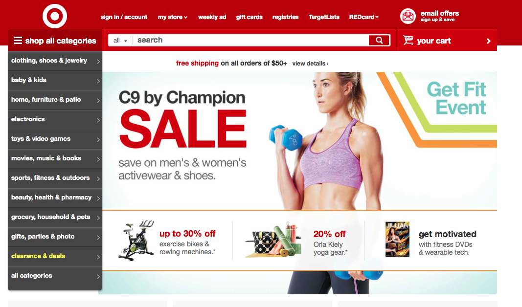
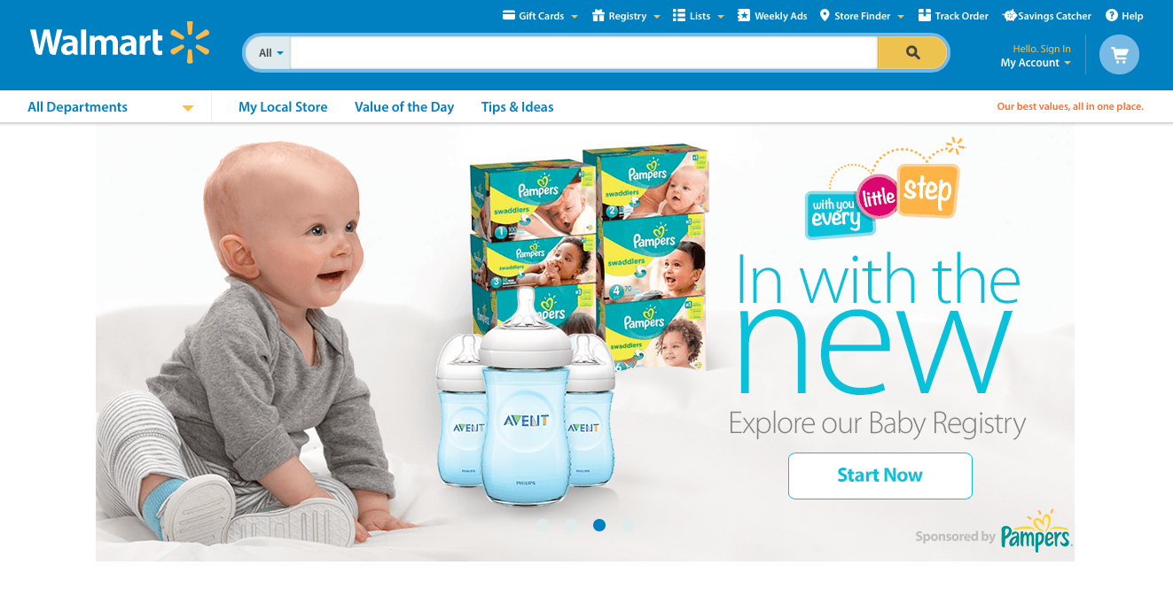
The existing Target and Walmart screenshots can remain because they illustrate the broader lesson. Use them as historical examples rather than descriptions of the brands’ current websites.
Businesses planning a redesign should connect visual decisions with usability from the beginning. A professional website development service can align the layout, branding, messaging, and conversion path instead of treating them as separate projects.
Write for People Before Trying to Impress Them
A polished website can still feel unreliable when the writing is careless. Spelling mistakes, broken sentences, vague claims, and inconsistent terminology interrupt the experience. They can also make visitors question the quality of the business.
Proofreading matters, but effective website copy goes beyond correcting grammar. The words should sound like the business while remaining easy to understand. Industry knowledge is valuable, but unexplained jargon creates distance. Visitors should quickly understand what the company does, who it helps, and why its offer is useful.
Natural copy works best when it answers the questions customers are already asking. What is being offered? How does it work? What does it cost? What happens after someone makes contact or places an order? Clear answers reduce uncertainty and help people move forward.

If the website has outdated, inconsistent, or generic text, professional website content services can strengthen important pages while keeping the brand voice recognizable. The goal is not to make every sentence sound clever. It is to make every sentence useful.
Make Navigation Feel Obvious
People rarely arrive on a website hoping to explore every page. Most have a purpose. They may want to view a product category, check a price, read about a service, find a location, or contact the company. Navigation should help them reach that destination without making them think about how the site is organized.
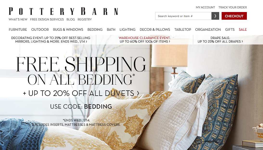
Use menu labels that customers naturally understand. Creative wording can add personality, but a menu is not the best place to become mysterious. “Services,” “Products,” “Pricing,” “About,” and “Contact” feel familiar because they work. When a site contains many pages, group related information under clear categories rather than trying to show everything at once.
Submenus should be readable on desktop and mobile screens. Links should be large enough to select comfortably, and important pages should not be hidden several layers deep.
Navigation also needs routine maintenance. Missing pages, outdated links, and unexpected redirects can break an otherwise smooth journey. A review based on these ways to diagnose website issues can reveal problems that are easy to overlook.
Make Every Page Easy to Use on Any Device
A consumer-friendly website should remain comfortable to use when the screen becomes smaller. Mobile visitors should not have to pinch the screen, scroll sideways, close oversized pop-ups, or struggle to tap a tiny button.
Responsive design is the foundation, but mobile usability also depends on content choices. Keep headings clear, break long passages into manageable paragraphs, and give buttons enough space. Important information should appear early because visitors may not scroll through a long introduction to discover what the business offers.
Forms deserve special attention. Ask only for information that is genuinely needed at that stage. A customer requesting a quotation may provide a name, email, phone number, and project details. The same person may abandon the form if it asks for a full history before anyone explains what happens next.
Images should support the experience without slowing it down. The existing visuals can remain, but they should use descriptive alt text, sensible dimensions, and compressed file formats. AOK Marketing’s image optimization for SEO guide explains how to improve their performance.
Reduce Friction During Checkout and Enquiries
Checkout is where interest becomes action, which makes unnecessary friction especially damaging. Customers should be able to understand what they are buying, review the price, choose the required options, and complete payment without feeling trapped in an endless process.
Keep the number of steps reasonable and show customers where they are. Allow guest checkout when an account is not essential. Explain delivery charges, taxes, availability, and return conditions before the final confirmation screen. Unexpected information at the last moment can weaken trust.
The same principle applies to service websites. A contact or quotation form is effectively a checkout for a lead. It should be clear, reassuring, and proportionate to the request. Tell people what information is required and when they can expect a response.
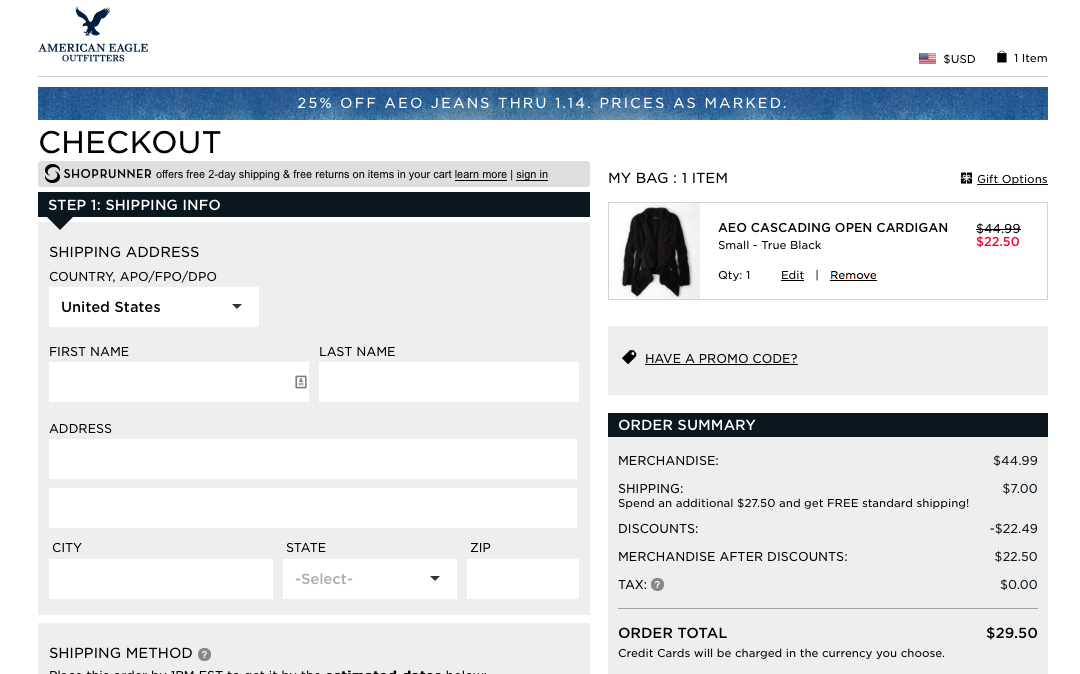
The screenshot reflects an earlier version of the website, so present it as a design example rather than a description of the brand’s current checkout.
Improving this journey is closely connected with conversion rate optimization services. CRO examines where users hesitate, become confused, or leave, then uses evidence to guide improvements. The purpose is not to pressure people into buying. It is to remove unnecessary barriers.
Build Trust Through Clear Details
A user-friendly layout gets people moving, but trust helps them continue. Visitors should be able to see who operates the business, how to make contact, what customers can expect, and where to find important policies.
Include clear product or service descriptions rather than relying on attractive images alone. Display contact information in an easy-to-find location. Add delivery, return, privacy, warranty, or cancellation information wherever it is relevant.
Calls to action should be specific. “Learn More” can work when the next step is educational, but “View Pricing,” “Request a Quote,” or “Book a Consultation” gives the visitor a clearer expectation. The wording should match the action that follows.
Trust also depends on consistency. Prices, service names, contact details, and policies should agree across the website. When two pages provide different information, customers are left to decide which one is correct.
Say Thank You and Explain What Happens Next
The experience does not end when a customer clicks “Place Order” or “Submit.” Confirmation pages and emails are part of the journey and should do more than display a cold system message.
A simple thank-you acknowledges that a real person has chosen the business. Confirm that the order or enquiry was received, explain what happens next, provide an expected response or delivery timeframe, and show how the customer can get help.
A retailer might provide tracking information, while a service business might explain how the consultation works. The next step should feel helpful.
Create a Website That Respects the Customer’s Time
A consumer-friendly website does not need to be complicated. It needs to be thoughtful. Clear pages, natural copy, simple navigation, mobile usability, transparent information, and an efficient conversion process all show respect for the visitor’s time.
The best way to evaluate the experience is to stop looking at the site as its owner and use it as a first-time customer. Can you understand the offer within a few seconds? Can you find important information without guessing? Can you complete the main action without unnecessary questions? Does the site explain what happens afterward?
Small improvements can make the entire business feel easier to work with. When customers can move through a website confidently, they are more likely to stay, explore, enquire, purchase, and return.
AOK Marketing helps businesses improve the connection between website design, content, usability, and conversions. Request a free growth proposal to identify practical opportunities for creating a clearer, more effective online experience.
About The Author