Would it surprise you to learn not all landing pages are created equal?

Landing pages are created with the sole intention of delivering users from the first point of contact– which is often an ad, a social media post, or a search result– to the point where they’re ready to convert. They’re used to appeal to users who are actively in the research and consideration stages, giving them just enough information to entice them to sign up for that newsletter, register for that event, or make that purchase. By taking the time to improve your landing page, you will get exponential returns on the time invested.
Not all landing pages, of course, are created equal, and a weak landing page is enough to derail an otherwise extraordinary ad, social media, SEO, or email campaign. With so much riding on this single point in the funnel, you can’t afford for it to be the weak link.
If you think that the conversion rates on your landing pages could be a little higher (which it always can be!), check out these 5 surefire, foolproof strategies that will improve your landing page and the results its generating.
1. Place CTAs Above & Below the Folds
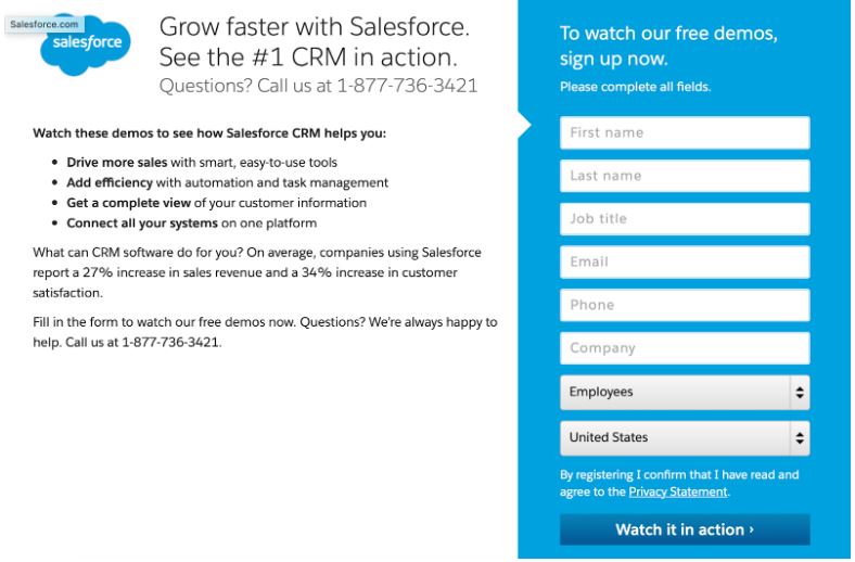
The whole point of the landing page is to give users exactly the information they need to convert, and you want them to be able to do exactly that the second they’re ready. While some landing pages will have lead forms, many will have clickable CTAs instead like “sign up now!” or “start your free trial!” that takes users to a secondary sign-up page.
If this is the case, make sure that you’re placing CTAs both above and below the fold on your page. You want at least one of those buttons to be in the user’s line of sight at all points, and it will absolutely make your landing page more effective.
No matter what type of action you’re optimizing for, make sure that you’re using clickable CTA buttons instead of just hyperlinked text. Multiple studies have shown that this is important, including a study from Copyblogger that found clickable buttons increased conversions by 45%.
For best results, make sure that you’re using high-contrast colors and clear fonts on that button to draw attention and entice clicks quickly. You want it to be the focal point of the page.
2. Feature Bullet Point Lists
In many cases, landing pages are going to be most effective when they can appeal to your target audience by mentioning pain points that you can solve, and then explaining exclusive features and benefits of your product or service that address that immediate pain point.
That being said, you also need your landing page to be succinct. Most people who are just kind of interested won’t stick around if they see giant blocks of tiny text.
The solution here is to feature bullet lists that are detailing either the features of your offering, or are explaining exactly what comes in a subscription with your company. This list should only follow a paragraph introduction explaining what exactly the product and service is, and hopefully appealing to a pain point or two in the process.
3. Include a Terms & Conditions Link
The truth is that most users won’t ever take a look at your terms of service, even if you’re selling big-ticket items; I was horrified when my realtor told me I was one of his only clients who ever read all the paperwork front to back, and I was buying a house.
People will notice, however, if your terms, conditions, and privacy statements aren’t there. They want to know that you have them, and it’s important for trust and credibility. It’s also an important requirement for ad services, some of which want to know that you have terms of service on that home page.
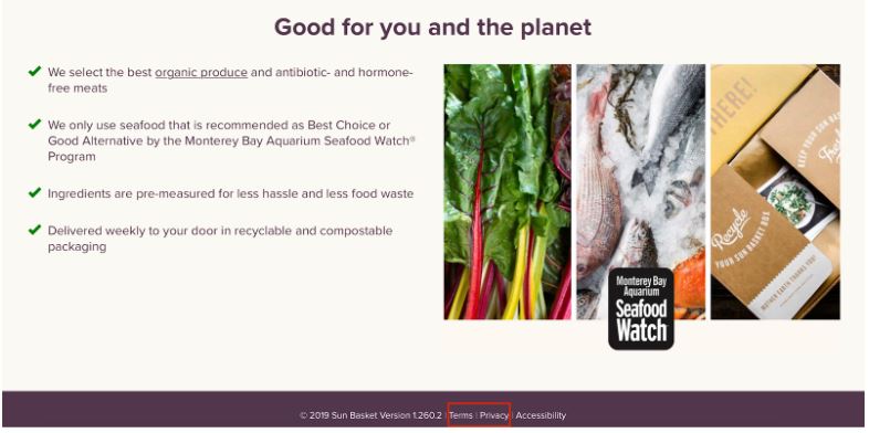
You can improve your landing page by featuring this under a CTA if relevant, but your bases are covered as long as it’s visual in the footer of the landing page, too.
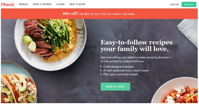
4. Opt for Shorter Copy
Some brands are fans of super long-form sales letters that go on for several pages, but in most cases this isn’t the approach you want to take. Again: most people don’t want to come to your site and see a big block of text, and no one wants to feel like they’re on the receiving end of a winding sales pitch that’s trying too hard. There’s a time and place for long-form sales text, but your landing page (in 95% of cases) won’t be it.
Instead, stick to shorter copy. Keep your sentence structure simple, and focus on adding enough information to make your ad powerful, but not so much that people lose interest.
If you have a big chunk of information to convey, that’s ok; use organization to your advantage, and keep it brief.
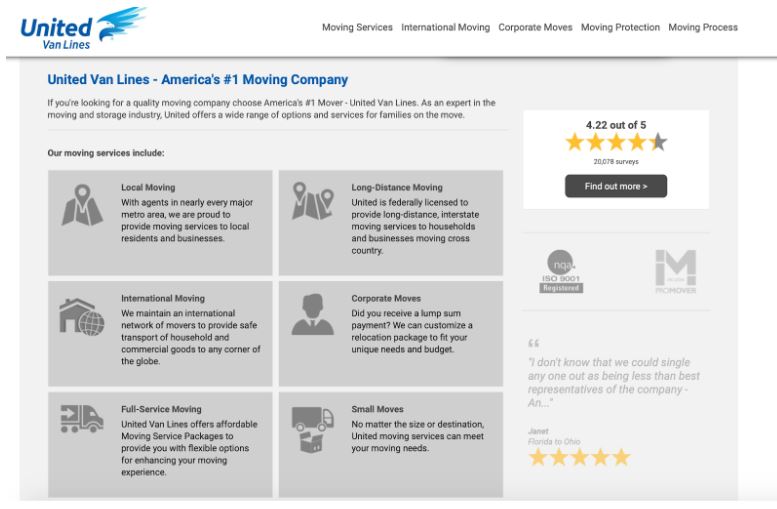
In the example above, the moving company has only two sentences about the company itself, and then one or two sentences detailing each service that’s organized cleanly and with graphics and visual breaks. They’re easy to scan, and gives users what they need to decide to move to the next step for more information.
5. Choose the Right Video Player
As a user, there’s probably one thing that sends me running from a landing page faster than anything else: seeing almost nothing aside from a video on the page, and only gives you the option to play and pause; you can’t rewind or fast forward. Most of these videos use the same approach of the long-form sales letter, and they tease valuable information but will only dangle it in front of you after ten minutes of saying how wonderful they are and what problems you’re experiencing.

These videos are not user-friendly. If they miss a part, it’s too bad; they have to go back and watch it again, or decide to leave. You’ll have more success if you give users the information they want right away instead of trying to keep them on the hook, and you don’t want people to be frustrated just by your video player.
When in doubt, opt for YouTube or Vimeo; both are easy to use and can quickly be embedded onto your landing page, but allows users to fast forward, rewind, and pause at any point. And if you really don’t want your video to show up anywhere but your landing page, you can mark it as “unlisted” on YouTube so that people can’t search for it.
Conclusion
As you’re hard at work on your landing page, keep in mind that some testing may be needed. A/B testing can be vital in troubleshooting any conversion issues you’re having, especially in terms of the offer you’ve got listed or the specific appeal you’re targeting in your copy. Tools like Unbounce can make this simple, letting you test two variations of your landing page at once.
As a reminder, it’s also important to ensure that your landing pages are relevant to all the ads sending users there; if there isn’t, you could see a decrease in ad ranking, an increase in CPC, and an overall drop off in success. If needed, create a second landing page for different ad campaigns– it’s well worth the time.
Are you struggling with getting results from your ad campaigns, or looking to improve your landing page?