- We’ve got all this traffic but no one is filling out our form.
- Why don’t people sign up for our newsletter?
- I’ve never been able to get Google AdWords or PPC (pay-per-click) ads to work for me. Am I missing something?
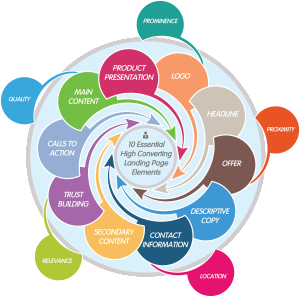
If you’ve ever asked yourself any of these questions, you may be missing some of the key elements of a high converting landing page:
-
Logo
-
Headline
-
Offer
-
Descriptive Copy
-
Product Presentation
-
Calls To Action
-
Trust / Confidence Building
-
Contact Information
-
Links to More Information (Secondary Site Content)
-
Template Elements (Main Site Content)
Not only are these elements important on their own, have to work with each other.
Take into account the following:
-
Relevance
-
Quality
-
Location
-
Proximity
-
Prominence
Now that you have the outline, let’s start at the beginning.
What is a landing page?
A landing page is a page on your site that matches up and answers a particular user query in an authoritative, trustworthy, and helpful way. Bottom line – it is a relevant search result when when people are looking for something using the Google search bar.
Put another way, a landing page is simply the place where traffic lands on your site after having come from some other site or search engine results page. In most cases this traffic will come from Google or some other search engine but not always. Also, your home page may be the most popular landing page on your site, but it’s not the only page they will arrive to.
Most of the time a landing page is a page that is designed to serve a certain purpose. This purpose is often to drive sales through online conversions, but can also be to inform and entertain people or attempt to interact with them.
Why is a landing page important?
Having a well designed landing page is especially important for paid search. If you are paying to have targeted visitors to your site, you should design every page with an end goal in mind. That end goal can be a user performing some desired action, or becoming a resource for information, or something else but whatever your goal is the page should be designed to perform it.
Something to note: Your page should be helpful and useful to people, not built for robots. If it is helpful Google will view the content as more valuable.
If you are designing a landing page to use with paid search, the utility of the page is important because you want it to perform whatever specific action is required in your marketing effort. Utility is the most important aspect of search engine quality for paid and organic search, and is therefore the most important thing for you to think about when designing landing pages. If your page is useful, it will get ranked higher.
The other major factor in designing a landing page is user intent. You must take into account the query, and the likely user intent of that query when designing a landing page. When designing a landing page, it is a good idea to design for one or both of the following:
Action intent – Users want to accomplish a goal or engage in an activity, such as download software, play a game online, send flowers, find entertaining videos, etc. These are “do” queries: users want to do something. The goal or activity may be to download, to buy, to obtain, to be entertained by, or to interact with a resource that is available on the Web.
Information intent – Users want to find information. These are “know” queries: users want to know something. The goal is to find information. Helpful pages have high quality, authoritative, and comprehensive information about the query.
So bottom line, a landing page is a page on your site that matches up and answers a particular user query in an authoritative, trustworthy, and helpful way.
Now that you have an idea of why people are coming to your page (you built it to be a helpful and useful page that is attempting to accomplish a goal), lets look at the elements one by one:
10 Essential High Converting Landing Page Elements
Logo
Your logo serves several functions on a landing page. First, it is there to establish trust. Any reputable brand has a well designed logo displayed prominently. This logo also serves another purpose as part of your main site content. In order to establish your overall website as a reliable source of information, trustworthy, and useful, having the ability to go to the home page of your website by clicking on the logo is a key part of a good landing page.
Headline
The headline of your landing page is important both from an end-user experience and from a machine experience on your site. If you are using paid search to drive traffic to a particular landing page, the headline will be used in determining the relevance of the landing page. The headline should align directly with your ad and your keyword that you’ve used to drive traffic to the landing page. This will improve your quality score and search engine results in the auction.
The headline is also very important from a regular user perspective because people need to know where they landed and if it’s relevant to their initial search query. Think of a newspaper headline. You expect to find information in an article that relates directly to the headline above it. Same with web pages. Clearly defining what the page is about at the top will help keep visitors on the site and reduce your bounce rates.

Offer
The offer on your landing page is very important especially if you’re trying to incite some particular action from your site visitors. Creating a sense of urgency, giving special discounts, or simply stating what the people will get by accepting your offer are all common ways to state an offer.
Descriptive Copy
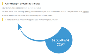
Descriptive copy on the landing page is vital and important for variety of reasons. You should remember the end goal for Google is to provide results that are helpful and useful in match up to a users search query. Text on the page that the Google bot can read is important to make sure that you are delivering an adequate landing page experience for your end-users.
Text on the page that describes what the page is about helps real people, not just robots, utilize the page more effectively and get the information that they are seeking. This creates a better overall user experience. More text will keep users engaged and hopefully enable them to spend more time on your site (which is again a positive indicator from a Google perspective on page trust).
Product Presentation
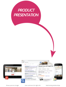
The first thing you must do is determine what your page is about. If you are selling a particular product or service then you should have a prominent and attractive product picture on that page. Images are high converting assets on any landing page, and enables a better user experience. However Google can’t read images. For the Googlebot you have to make sure you’re utilizing proper alt text, labeling, and captioning your pictures so that Google can recognize what the photo is about. Even if you aren’t trying to sell a particular product or service you should still include relevant images for a better user experience.
Calls To Action
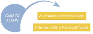
Your landing page should be designed for your users to perform some particular action. This may be to participate in a discussion, sign up for a newsletter, submit a quote request, or something else. Whatever your measurement of success is, the more obvious and clear that you can make this desired action the better. Multiple calls to action are very important if the user must scroll down to see more of your descriptive text and product images. A good rule of thumb is you should have one call to action for each screen size when scrolling down.
A note on buttons: Some call to action buttons have been so overused that people just don’t even notice them anymore. We recommend action based words in your call to action buttons, something like “Get Started” is a good example of text you can use. Also, a contrast color. It doesn’t have to be a specific color, just something that is really obvious and stands out against the rest of the page.
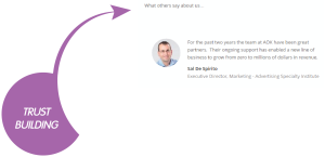
Trust / Confidence Building
Trust and confidence building elements are some of the most important items on your landing page. This secondary content is important both from a machine perspective as well as end-user perspective.
From a machine perspective Google will trust third-party reviews before it trust’s the information on your site or landing page. Every site says it is great, but if you can link out to third-party citations and references this makes that age all stronger from a Google perspective.
Also from an end-user experience perspective having well known company logos and testimonials with information provided about some happy customer experiences goes a long way when trying to sell a product. The vast majority of product research for online purchases is now done on third-party sites and social networks. The more times that you and your products are mentioned in a positive way on 3rd party sites such as Google Plus / Google My Business or Yelp, the better.
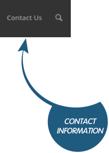
Contact Information
Contact information is very important from a landing page perspective as part of your main content on your website. This is also a trust building element that you should use to help gain the visitor’s trust and the machine’s trust. It should clearly outline who you are, what your website is about, and the fact that you are actually a legitimate business.
Contact information such as clearly defined hours of operation, store locations, and multiple contacts at your company is key in establishing good rapport and earning a good reputation online.
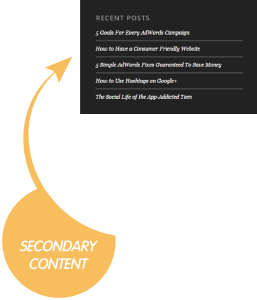
Links to More Information (Secondary Site Content)
Circling back around to the original design and purpose of your page from a Google perspective, having helpful links out to more information is key for Google to establish whether or not your pages are helpful, useful, and authoritative.
Some companies and people will advise you not to have anything on your landing page other than simply the call to action that they want you to perform. They tell you DO NOT have any other links on your page to other site content. This indicates a number of things to Google, the most important of which is the fact that the site is trying to manipulate the end-user into a particular action. This is an issue from an end user perspective and a machine perspective.
There’s nothing more annoying than getting to a page that you may be potentially interested in and then not being able to learn anything else about the company from that page. There’s nowhere to go and that point your only option is the back button. The back button is the enemy of all online marketers, it means you’ve failed in accomplishing your goal, especially if you’ve paid for someone to come to your landing page. That’s like getting kicked when you’re down.
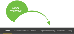
Template Elements (Main Site Content)
Main site content is important from a user experience perspective. An example of some template elements are the top navigation bar or the footer on your website. These link to more information internally as well as other information such as your privacy policy, your returns information, or your customer service information. These elements are key in Google establishing how trustworthy and good your website is and are especially important if your site is something that involves transactions. For example a shop, or online store, or some other utility that will separate the users from their money. In these cases having easy to find contact information and secondary elements is also very important.

How this all fits together
Now that we have a basic understanding of the necessary elements on a landing page, let’s take a look at how they work together.
Relevance
Relevance is very important both from an organic and paid search perspective. The user’s query that they’ve written into the Google search box should match very closely with the information and relevance of that landing page, especially if you’re paying for clicks to that page.
For paid search Google takes into account your keywords, your ad text, and your landing page experience to come up with an overall quality score associated with any particular keyword. The higher the quality score the more relevant the landing page experience and the less money you actually have to pay to have visitors come to that landing page.
But even more than that the information on the page should be relevant to the different elements. Your product picture should be accurately reflected in the descriptive copy and the product or service that you’re selling should align with what your site is about. This relevance will improve the overall user experience a Google rank your higher as a result.
Quality
Quality is a much more subjective measure but some simple rules of thumb will help you improve the quality of the landing page experience. Bearing in mind that the purpose of the page should be to provide a helpful, useful, and authoritative page, simple misspellings of words, poor quality copy, blurry or small pictures, and a lack of secondary content to support the pages will result in a poor quality user experience.
From a machine perspective having images on your site is fine but you need to label them adequately. If you have properly labelled the images on your page it may get a lower quality estimate by the machine due to the fact that it can’t read photos.
Location
The location of all of these elements is just as important as the necessity to have them on the page. Some people try to go for a unique layout, but unfortunately all that does is confuse users were expecting to find things. Unique is good but your design should be intuitive, and elements should be where people expect to find them.
The second thing that you need to take into account is the fact that not everyone will scroll down on your page. Your page should have all of the necessary elements if possible above the fold (or within one screen shot at the top).
This optimized user experience is very important on alternative devices such as laptops and mobile phones. A responsive website that identifies what browser and what type of devices visiting your site and then serves up the best user experience is crucially important to any site redesign. This will help the end-user experience immensely with properly designed and will enable you to have your landing page elements presented to them when they arrive.
Proximity
The proximity of any of the elements is also important. You should group certain elements together such as trust building elements with clear divisions and indicators if there is more information to scroll down to. Proximity also plays an important role in overall attractiveness and utility of design. If you have a page that is all text and is not broken up at all by any calls to action or product pictures this can often be a challenge for people. Even the most encyclopedia based websites such as Wikipedia break up their content with photos and citations.
Also from a utility perspective if there’s a particular action that you want a user to take this should be in close proximity to the information they require to make that decision.
Prominence
The final element is prominence. This is especially important when taking into account the various design elements and main content of your site. It’s up to you how prominent you want links to your privacy information and other content in your template elements, versus how large you want your product photo to be.
In any case it is very important that you have a prominent call to action if you are requiring a particular action on that page. We recommend a contrast color and it doesn’t necessarily have to be any particular color such as orange or green it just has to stand out from the rest of the information on the page and be labelled clearly as to what desired action you want the customer to take.
Summary
There you have it, all the essential elements and how they fit together. In case you missed it, here’s the summary again:
- Logo
- Headline
- Offer
- Descriptive Copy
- Product Presentation
- Calls To Action
- Trust / Confidence Building
- Contact Information
- Links to More Information (Secondary Site Content)
- Template Elements (Main Site Content)
Not only are these elements important on their own, have to work with each other. Take into account the following:
- Relevance
- Quality
- Location
- Proximity
- Prominence
Good luck!
About The Author
Dave Burnett
I help people make more money online.
Over the years I’ve had lots of fun working with thousands of brands and helping them distribute millions of promotional products and implement multinational rewards and incentive programs.
Now I’m helping great marketers turn their products and services into sustainable online businesses.
How can I help you?


