USA
32 East 57th Street, 8th Floor
New York, NY 10022
USA
Phone 646.453.7550
CANADA
250 Wincott Drive,
Toronto, ON M9R 4C8
Canada
Phone 416.815.8000
See For Yourself What Your Site Looks Like On Different Mobile Devices
See For Yourself What Your Site Looks Like On Different Mobile Devices Just enter ANY site… click on the ‘GO’ button… and see for yourself.
Our Mobile Readiness Grader tool above will show you what your site looks like on mobile devices… including the iPhone 3, iPhone 4, iPhone 5, iPhone 6, iPhone 6 Plus, Android Nexus 4, iPad, and even the Kindle!
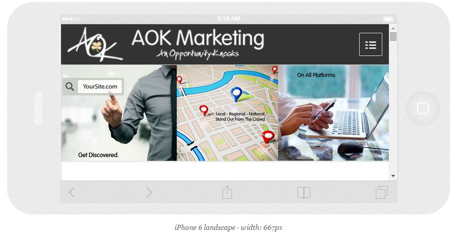
Curious what your site looks like on different devices? Here’s an example of this website on an iPhone 6 – holding it sideways:

On each of the screens above, does your site look natural? Does it adapt to the different screen sizes showing different sized pictures on each device? Do you have to scroll left and right or try to zoom into the text to see it properly?