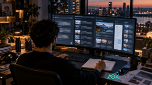
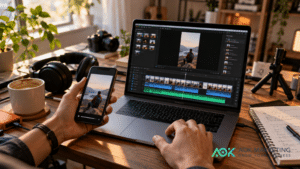
AI-generated images have become a valuable tool for digital marketing. Businesses can now create blog graphics, social media visuals, advertising concepts, email banners, product mock-ups, and campaign imagery faster than ever before.
However, speed alone does not create a strong brand.
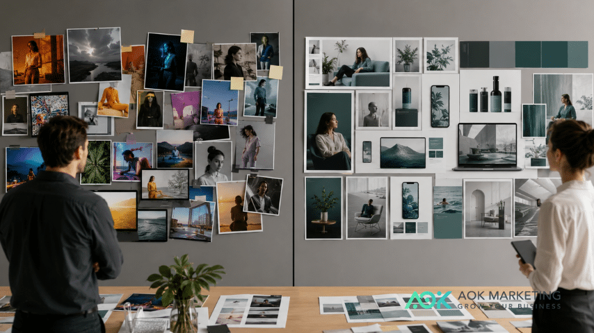
When AI-generated images are created without a clear visual system, they can quickly become inconsistent. One image may look bright and playful, while the next appears dark and corporate. Colours may change from one campaign to another. Logos may be placed differently each time. People, products, backgrounds, and lighting styles may not feel connected.
The result is content that looks visually impressive on its own but does not immediately feel like it belongs to the same company.
Brand consistency helps audiences recognize and remember a business. Every visual does not need to look identical, but it should feel connected to the same brand. The colours, lighting, composition, tone, and overall creative direction should work together across websites, advertisements, social media posts, email campaigns, and other marketing channels.
AI can support that consistency, but only when it is guided by a clear strategy.
Here is how businesses can keep AI-generated images aligned with their brand.
Start With a Clear Brand Visual System
Before creating AI-generated images, establish the visual rules that define your brand.
A basic brand visual system should include:
- Primary and secondary brand colours
- Preferred lighting style
- Photography or illustration style
- Composition preferences
- Font and graphic treatment
- Logo usage rules
- Target audience
- Brand personality
- Examples of approved visuals
- Examples of visuals to avoid
These guidelines give AI image creation a consistent foundation.
For example, a luxury consulting company may prefer neutral colours, soft natural lighting, minimalist interiors, sophisticated clothing, and clean compositions. A children’s education brand may use brighter colours, playful illustrations, rounded shapes, and energetic scenes.
Without these decisions, every AI prompt becomes a separate creative experiment. With them, each image becomes part of a larger and more recognizable brand identity.
Your visual system does not need to be complicated. Even a one-page reference sheet can significantly improve consistency. The important thing is to make specific decisions instead of relying on general instructions such as “make it professional” or “make it modern.”
Use Brand Colours Intentionally
Colour is one of the fastest ways people recognize a brand.
When creating AI-generated images, include your brand colours in a deliberate and controlled way. They do not always need to dominate the entire image. Instead, they can appear through clothing, product packaging, furniture, backgrounds, props, interface elements, accent lighting, or graphic overlays.
For example, a company with teal as its primary brand colour might use teal notebooks, cushions, wall accents, presentation folders, clothing details, or digital interface elements within its images.
The goal is to create visual continuity without making every image look overly staged.
It is also helpful to specify whether colours should appear as:
- Dominant background colours
- Subtle accent colours
- Product colours
- Clothing details
- Environmental elements
- Graphic overlays
- Borders or shapes added after generation
AI tools may not always reproduce an exact colour code accurately. If precise brand colours are required, the image can be adjusted during post-production using design software.
A practical approach is to generate the image with the correct general colour family, then apply exact brand colours when adding graphics, text, buttons, borders, or overlays.
Brands should also avoid introducing too many unrelated colours. Even if an AI-generated scene looks attractive, a strong red, orange, or purple element may clash with an established blue-and-green brand palette.
Consistent colour use helps separate branded imagery from generic AI content.
Define a Consistent Lighting Style
Lighting has a major influence on how an image feels.
Bright natural light can make a brand appear friendly, transparent, energetic, and modern. Soft studio lighting may feel polished and premium. Dark, high-contrast lighting can create a dramatic or luxurious atmosphere. Warm lighting may feel welcoming, while cooler lighting can communicate technology, efficiency, or innovation.
If your AI-generated images use a different lighting style every time, your visual identity may feel disconnected.
Choose one or two preferred lighting approaches for most brand visuals.
For example:
- Bright natural daylight for approachable service brands
- Soft diffused studio lighting for product-focused companies
- Warm editorial lighting for lifestyle brands
- Clean cool lighting for technology businesses
- High-end directional lighting for luxury companies
Include these lighting preferences in your prompts.
Instead of requesting “a professional office,” you might request:
“A bright modern office with soft natural daylight, gentle shadows, and a clean, welcoming atmosphere.”
For a more premium brand, you could use:
“A sophisticated office interior with soft directional lighting, subtle contrast, and an elegant editorial mood.”
Lighting should also match the platform and campaign. A serious thought-leadership article may require a calmer visual than a high-energy promotional post. However, both images can still use the same general lighting philosophy.
Create Repeatable Composition Rules
Composition refers to how people, products, objects, and empty space are arranged within an image.
Consistent composition helps marketing materials feel organized and recognizable.
Start by deciding how your brand typically presents visual subjects. Do you prefer centered product shots? Lifestyle scenes with the subject positioned to one side? Wide editorial photographs with room for headlines? Close-up images with minimal backgrounds?
Common composition styles include:
- Centered and symmetrical
- Clean and minimalist
- Editorial with natural movement
- Product-focused with controlled spacing
- Wide landscape with text space
- Close-up and detail-oriented
- Layered scenes with foreground and background depth
For marketing purposes, it is often useful to request negative space. Negative space is the open area around the main subject where text, headlines, buttons, or logos can later be added.
For example:
“A business owner working at a laptop, positioned on the right side of the image, with clean negative space on the left for headline placement.”
This type of instruction creates images that are easier to use in advertisements, blog covers, social graphics, and website banners.
Consider creating separate composition rules for different formats:
- Landscape images for blog covers and website banners
- Square images for social media feeds
- Vertical images for Stories, Reels covers, and mobile ads
- Wide images for LinkedIn graphics and email headers
Consistency does not mean using the same layout every time. It means building a recognizable set of composition patterns that support your brand and content needs.
Choose a Distinct Visual Style
AI-generated images can imitate a wide range of visual styles, including editorial photography, product photography, illustrations, three-dimensional graphics, paper-cut designs, cinematic scenes, and minimalist digital art.
The challenge is not choosing an attractive style. The challenge is choosing a style that fits your brand and using it consistently.
A digital marketing company, for example, might use realistic editorial photography featuring modern workspaces, business teams, screens, content creation, and campaign planning. Another agency may prefer bold conceptual illustrations that represent abstract topics such as search visibility, automation, customer journeys, or brand growth.
Both approaches can work, but switching randomly between photorealistic portraits, cartoon illustrations, futuristic three-dimensional art, and vintage photography may weaken brand recognition.
Define a primary visual style and one or two supporting styles.
For example:
Primary style: Realistic modern editorial photography
Supporting style: Minimalist business illustrations
Occasional style: Clean product mock-ups
You should also define what your brand does not use.
Your exclusion list may include:
- Excessively futuristic imagery
- Neon cyberpunk colours
- Unrealistic facial expressions
- Overly dramatic lighting
- Cartoon-style characters
- Cluttered backgrounds
- Generic corporate handshakes
- Artificial-looking office scenes
- Obvious visual stereotypes
These exclusions can be included directly in prompts or used during the review process.

Keep People and Environments Believable
One of the most common problems with AI-generated brand images is that they can feel artificial.
People may appear overly perfect. Offices may look too polished to be believable. Facial expressions can feel exaggerated. Clothing, body language, and interactions may not reflect real working environments.
To create more authentic images, ask for specific human details.
Instead of requesting “a diverse marketing team,” request:
“A mixed group of marketing professionals in their late 20s to 40s collaborating naturally around a table, wearing smart casual clothing, with realistic expressions and relaxed body language.”
You can also request natural imperfections, candid moments, practical workspaces, realistic desk items, and subtle background activity.
Authenticity is especially important for service businesses. Customers want to see relatable people and credible environments, not images that look like generic futuristic advertisements.
Your AI-generated people should also reflect the audiences and communities your brand serves. Representation should be thoughtful and relevant rather than added randomly.
Create Clear Rules for Logo Placement
AI image tools are generally not reliable for generating accurate logos or readable branded text. Logos may appear distorted, misspelled, or completely altered.
For that reason, it is usually better to generate a clean image first and add the official logo afterward using a design platform.
Establish consistent logo placement rules, such as:
- Bottom-right corner for social graphics
- Top-left corner for presentation images
- Centered on products for mock-ups
- Small and subtle on lifestyle visuals
- White logo on dark backgrounds
- Full-colour logo on light backgrounds
- Minimum spacing around the logo
- Maximum logo size relative to the image
Avoid placing logos in random locations simply because there is empty space.
Logo placement should feel intentional and should not distract from the main message. In most cases, the logo is there to support brand recognition, not dominate the entire image.
When creating product mock-ups, use blank products or simple placeholder marks during generation. Add the real logo during editing to ensure accuracy.
Build Reusable Prompt Templates
One of the most effective ways to maintain consistency is to create standardized prompt templates.
Instead of writing every prompt from scratch, build a structure that includes your brand’s recurring visual requirements.
A useful AI image prompt template may include:
Subject: What is happening in the image?
Audience: Who should the image appeal to?
Environment: Where does the scene take place?
Brand colours: Which colours should appear?
Lighting: What type of lighting should be used?
Composition: Where should the subject be positioned?
Visual style: Photography, illustration, product shot, or another format?
Mood: Professional, friendly, energetic, premium, calm, or innovative?
Format: Landscape, square, or vertical?
Exclusions: What should not appear?
Here is a sample template:
“A realistic editorial photograph of [subject] in [environment], created for [target audience]. Use [brand colours] as subtle accents through [specific objects or details]. Include [lighting style] and a [mood] atmosphere. Position the main subject [composition instructions] with negative space for text. Modern, polished, authentic, and suitable for a digital marketing campaign. [Format instructions]. No readable text, no distorted hands, no inaccurate logos, no watermark, and no cluttered background.”
This template can then be adapted for different campaigns while maintaining the same core creative direction.
Create Prompt Libraries for Different Content Types
A single prompt template may not work for every marketing asset.
Create a small prompt library for your most common needs, such as:
- Blog cover images
- Social media graphics
- Email banners
- Website hero images
- Paid advertising concepts
- Product mock-ups
- Case study visuals
- Team and workplace scenes
- Seasonal campaign images
- Thought-leadership graphics
unif Each template should include the correct format, composition, and text-space requirements.
For example, blog covers may require wide landscape compositions with strong central concepts. Social media graphics may need bolder subjects that remain clear on small screens. Website hero images may require large areas of clean negative space for headlines and calls to action.
A prompt library saves time and reduces visual inconsistency across your content calendar.
Review Every Image Before Publishing
AI-generated images should not be published without human review.
Examine each image for:
- Accurate hands, faces, products, and objects
- Consistent brand colours
- Appropriate lighting and mood
- Realistic environments
- Correct cultural and professional context
- Space for text and logos
- Visual connection to previous brand content
- Unwanted text, symbols, or visual distortions
- Potential copyright or trademark concerns
It can be helpful to compare new visuals with a set of previously approved brand images. Ask whether the new image would look natural beside them on a website, Instagram grid, LinkedIn page, or presentation.
If the answer is no, the prompt may need to be refined.
Combine AI With Human Design
AI-generated imagery works best as part of a broader creative process.
The AI tool may produce the base image, but a designer or marketer should still make decisions about cropping, colour correction, typography, logo placement, graphic overlays, and final formatting.
This human layer is what turns an AI-generated picture into a branded marketing asset.
A digital marketing team also understands the strategic purpose behind the image. It can determine whether the visual supports the campaign message, speaks to the correct audience, fits the platform, and encourages the intended action.
AI can accelerate production, but brand strategy should remain human-led.
Consistency Makes AI Images More Valuable
AI-generated images can help businesses create more customized and flexible marketing content. However, producing more images is not the same as building a stronger brand.
The most effective AI visuals are created within a clear brand system. They use recognizable colours, consistent lighting, repeatable compositions, a defined visual style, thoughtful logo placement, and structured prompt templates.
When these elements work together, AI-generated content feels intentional rather than random.
Your audience may not know that specific colours, lighting choices, or composition rules are being repeated, but they will begin to recognize the overall feeling of your brand. That recognition builds familiarity, trust, and long-term visibility.
AI provides the creative speed. Brand strategy provides the direction.
Businesses that combine both can produce high-quality visual content more efficiently without losing the identity that makes their marketing recognizable.
About The Author